
Find a Batten Finish That Works With Your Home and Garden
The best composite batten cladding colours complement the materials already around them. Brickwork, render, window frames and paving all influence whether a finish appears warm, cool, understated or bold.
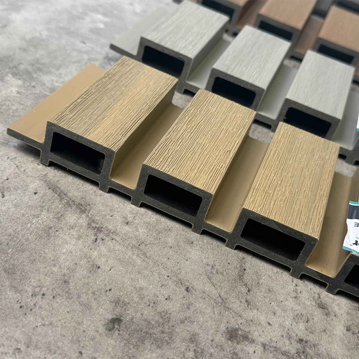
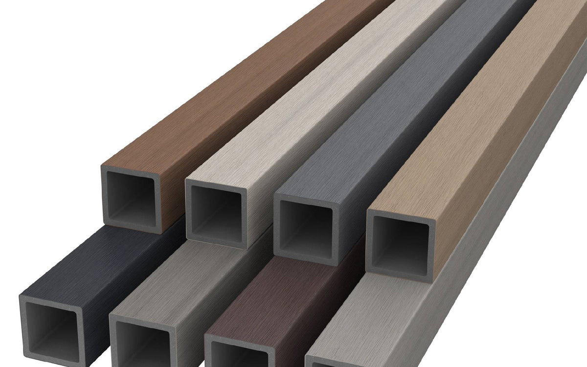
Dark shades can give an entrance a defined outline, timber-inspired tones can soften contemporary architecture, and pale finishes can create a quieter contrast. This guide compares the palette featured in the NeoTimber® Louvre Batten range and explains how to judge the colours in the setting where they will be used.
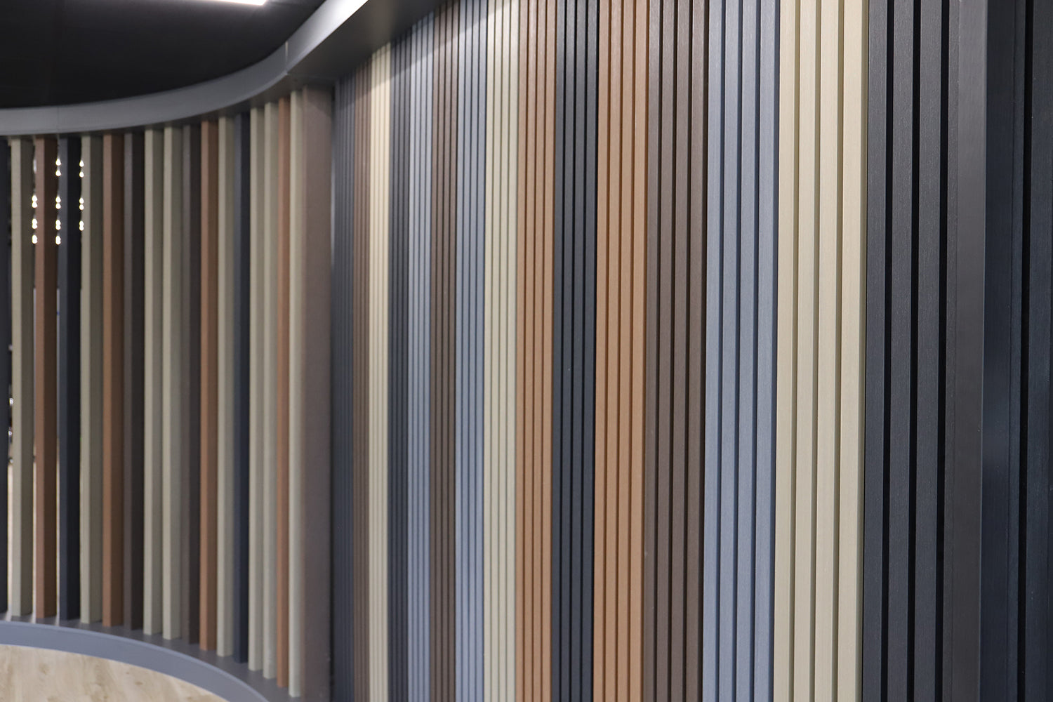
Compare the Colour Families
Start with the overall effect you want rather than choosing a colour in isolation. The groups below are design starting points: each finish will look different with changes in light, background and surrounding materials. Confirm availability for your chosen profile before ordering.
Colour ideas for a coordinated batten cladding scheme:
| Finish | Design direction | Pairings to explore |
|---|---|---|
| Charcoal | Dark definition and architectural contrast | Pale render, glazing and lighter paving |
| Chocolate | A rich, warmer dark tone | Stone, warm brickwork and leafy planting |
| Oak | Warm timber-inspired character | Neutral render, dark frames and natural textures |
| Teak | A warm wood-effect palette | Stonework, garden planting and restrained metal details |
| Antique | A muted, weathered-wood appearance | Soft neutrals, stone and contemporary landscaping |
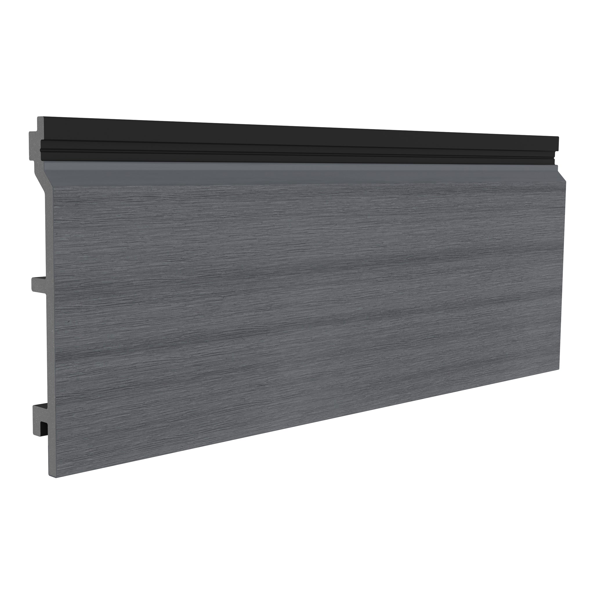
| Grey | A neutral contemporary base | White render, dark frames and varied planting |
| Silver Birch | A softer timber-inspired neutral | Pale stone, glazing and relaxed garden schemes |
| Ash White | A light, crisp finish | Dark architectural details and simple planting palettes |
Dark Finishes: Charcoal and Chocolate
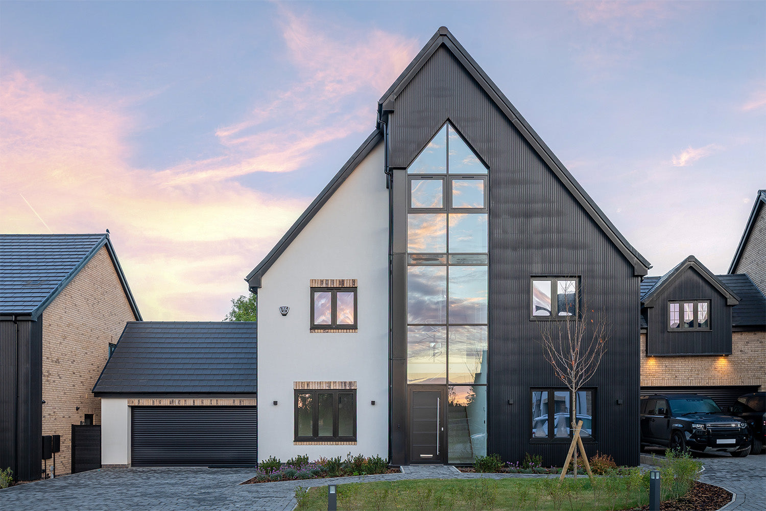
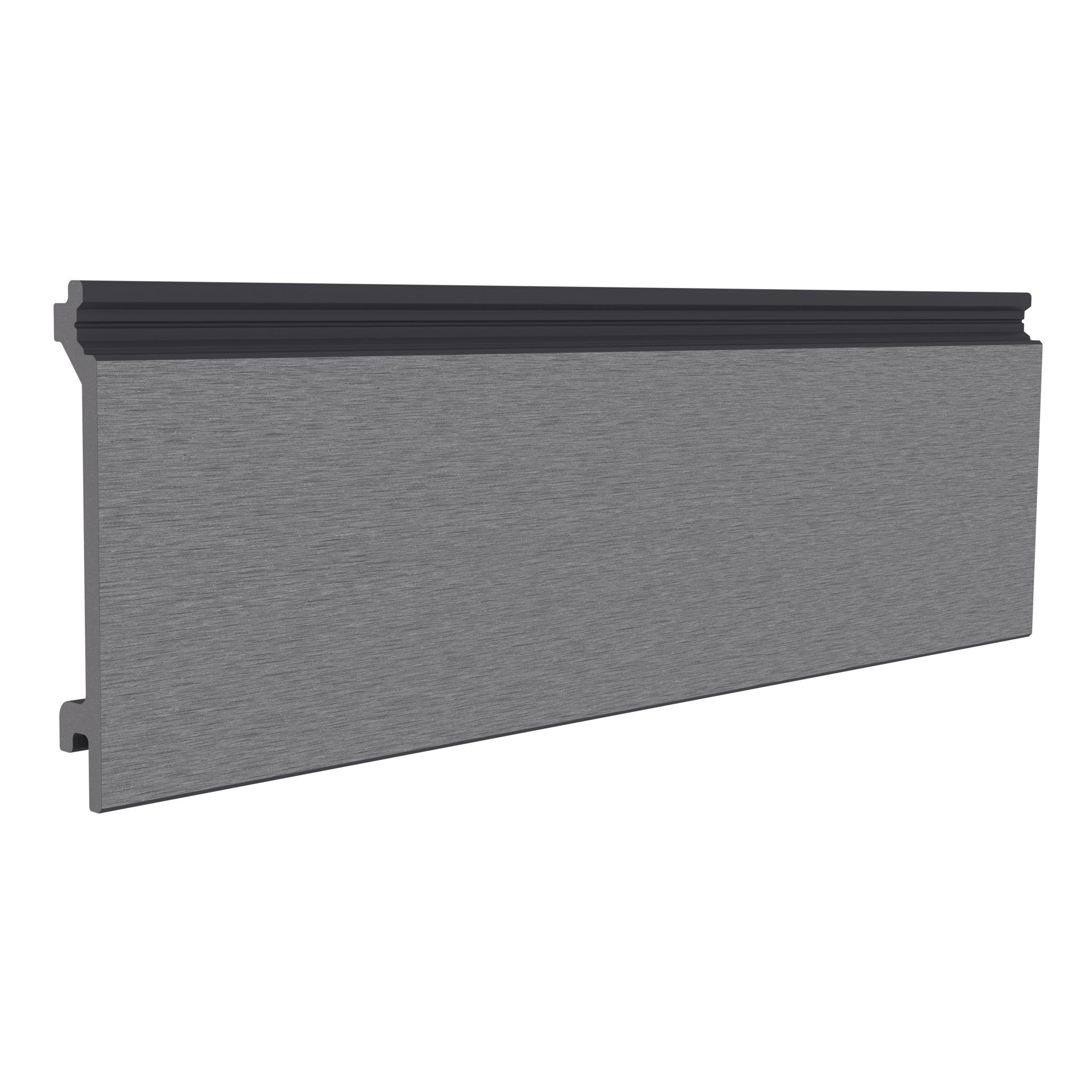
Charcoal gives a feature panel a strong outline, particularly beside light masonry or render. It can repeat the dark accent of window frames without requiring every surrounding surface to match.
Do not assume Charcoal is an exact substitute for a particular black coating. Compare samples directly with the frames or trims you want to coordinate, especially where the two surfaces meet.
Chocolate offers a warmer direction for a dark scheme. Try it alongside brick, stone and planting to see whether its undertones suit the property. On a large elevation, consider how much dark material will be visible from the street and from inside the home.
Warm Wood Effects: Oak, Teak and Antique
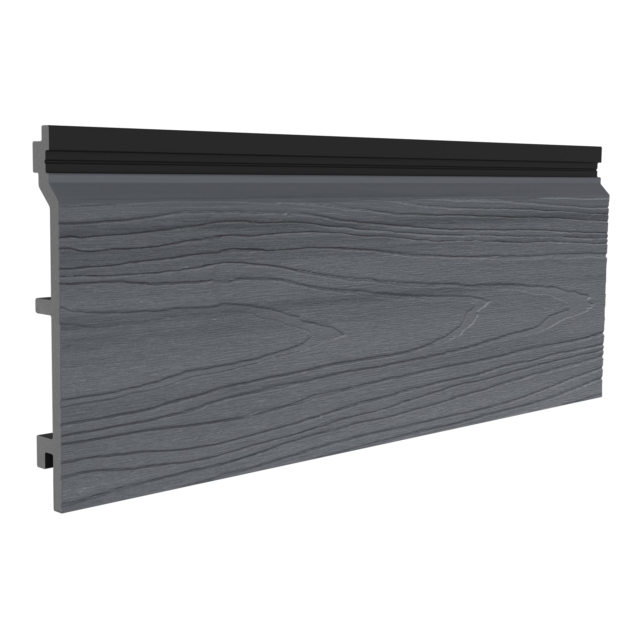
Timber-inspired finishes can balance the sharper lines of glass, metal and rendered walls. Oak introduces a familiar warm character, while Teak offers another route to a wood-effect palette. Antique provides a more muted alternative for a softer composition.

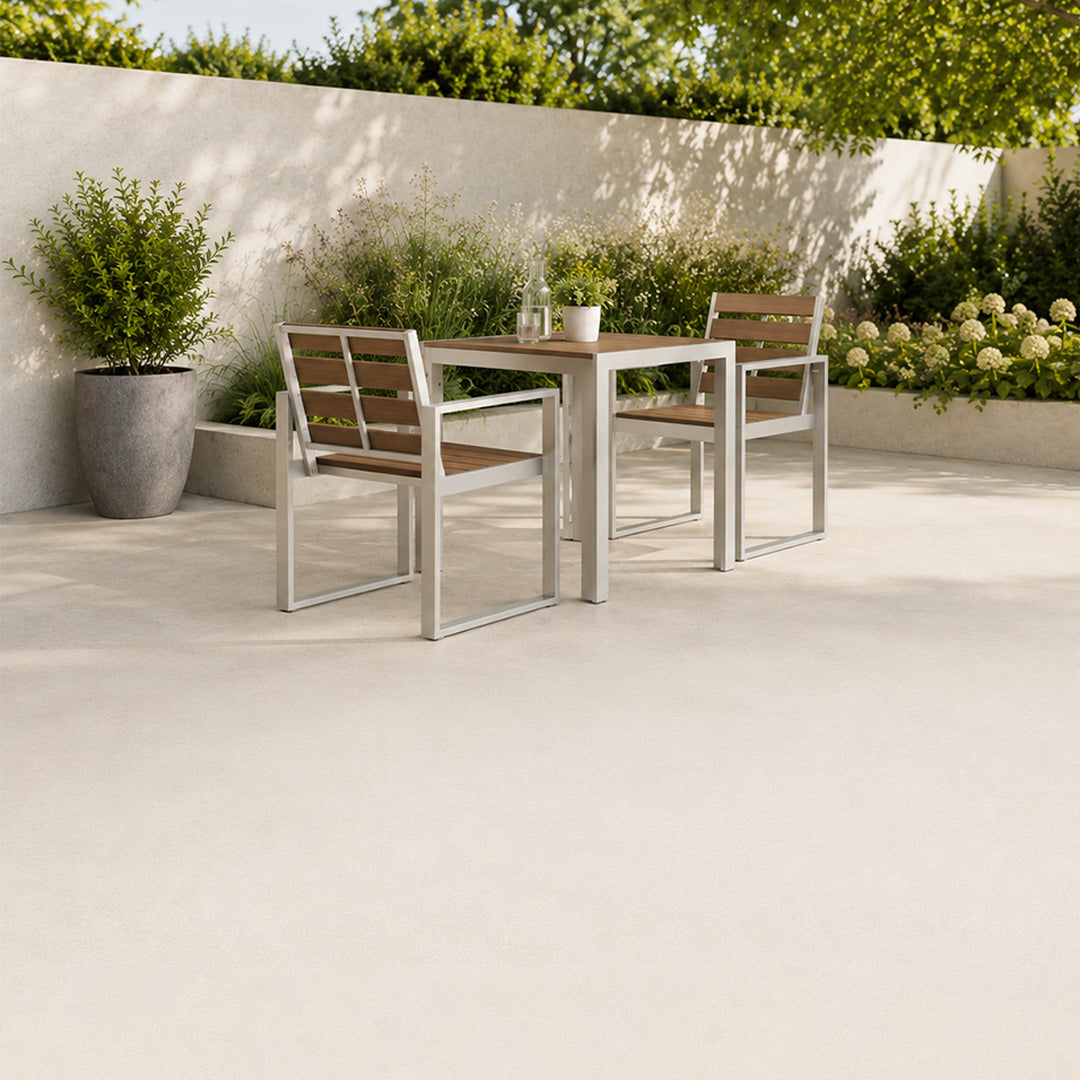
These shades can work as a transition between the house and garden. Repeat a warm tone in a smaller feature, such as furniture or a planter, rather than trying to make every element identical.
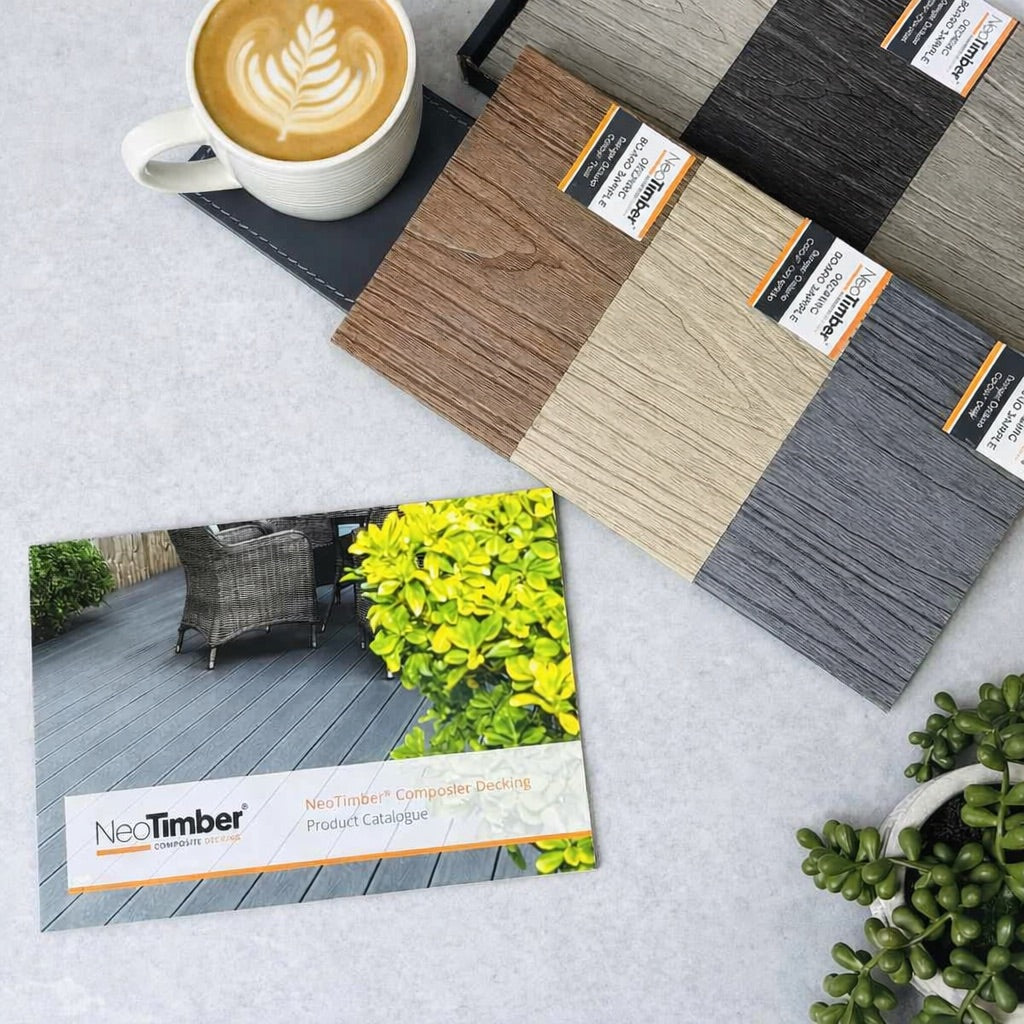
Compare the finishes side by side through the batten cladding collection and the Louvre Batten product information.
Light and Neutral Options: Grey, Silver Birch and Ash White
Grey can provide a restrained backdrop where the building already has several materials or strong planting colours. Silver Birch offers a softer neutral direction, while Ash White creates a lighter feature against darker architectural details.

A pale palette can support Scandinavian- or coastal-inspired styling, but that is an aesthetic choice rather than evidence of coastal suitability. The complete product and fixing specification still needs to suit the location.
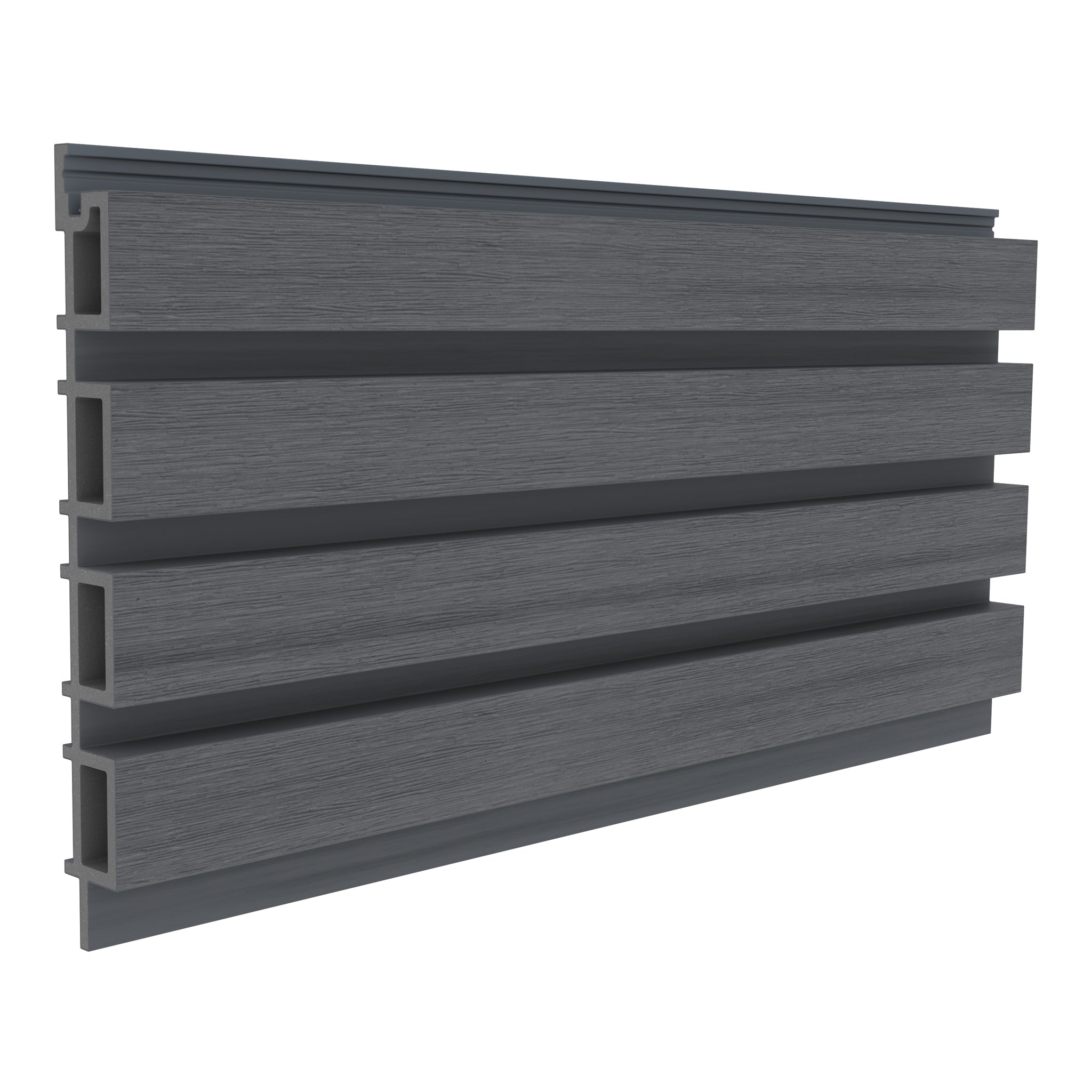
Consider the background behind open profiles as well. A dark backing can make light faces stand out, while a similar-toned background produces a quieter overall effect.
Match or Contrast With Windows, Roofs and Paving
Take a whole-property view before narrowing the shortlist. Identify the permanent materials that will remain: roof tiles, brick, stone, frames and driveway surfaces are often more influential than movable furniture.
Choose whether the batten feature should blend into that palette or stand out. Matching the general tone of a roof trim can create continuity; a warm finish beside cool frames can add deliberate contrast.
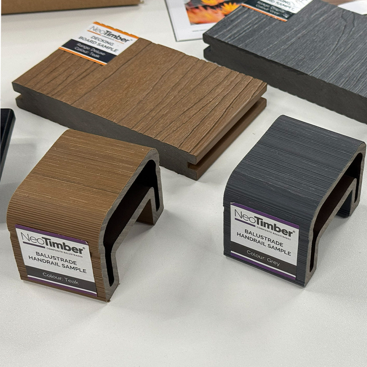
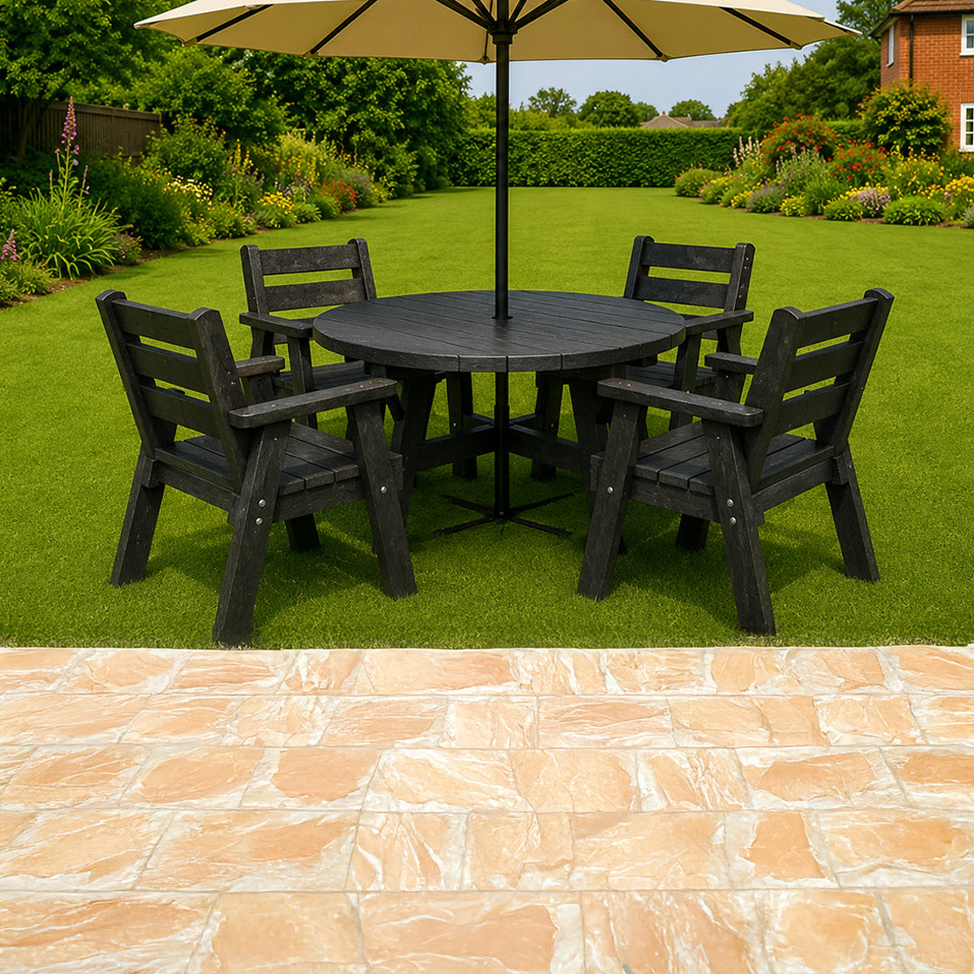
Where you want to coordinate with decking or fencing, check the specific products. Shared colour names do not guarantee identical grain, undertone or texture across ranges.
Spacing and Light Change the Appearance
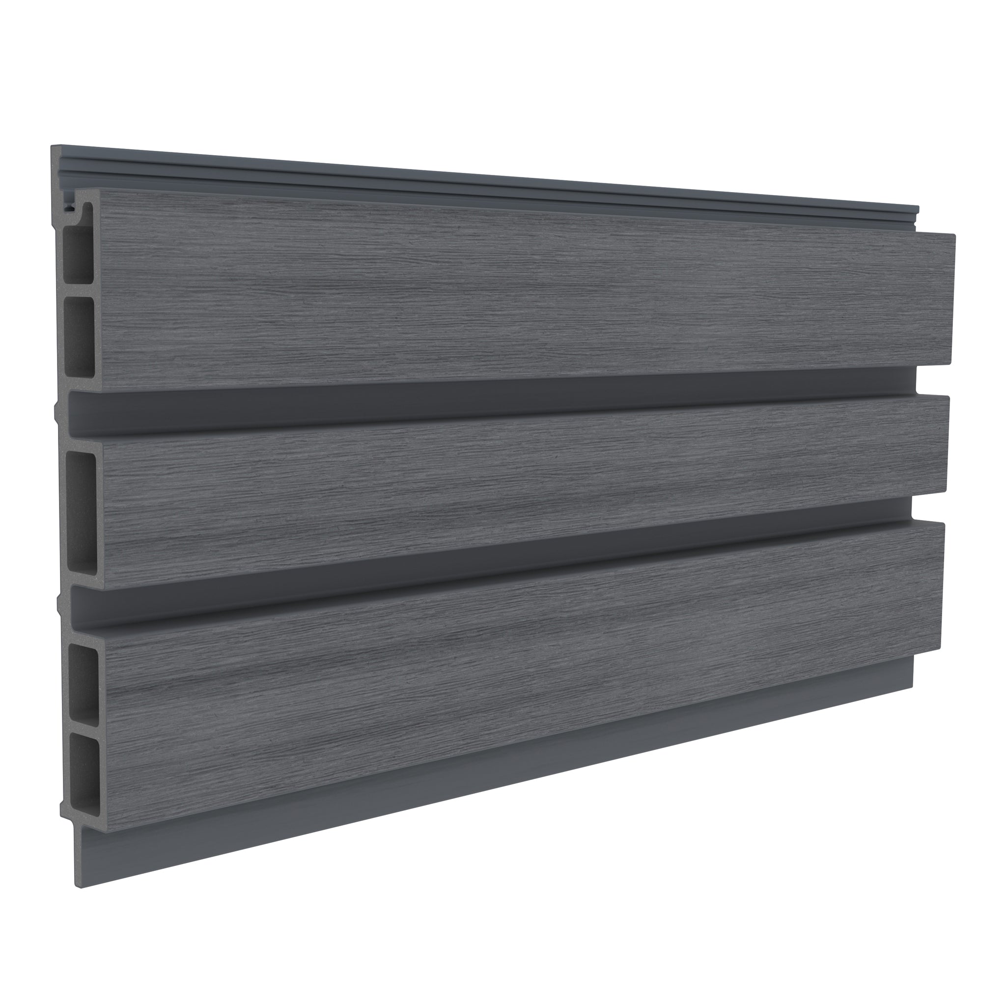
The colour is only part of what you see. Narrow gaps can create a denser pattern, while wider gaps reveal more background. Profile projection influences shadow and how the feature looks from an angle.
Direct sunlight, overcast conditions and shade can give the same sample a different character. Test it in the proposed orientation where possible and stand back to judge the wider elevation.
Our guide to batten sizes and spacing explains how proportions affect the design. Keep the visual arrangement within the chosen system’s technical requirements.

Use Samples to Make the Final Choice
- Shortlist two or three finishes that suit the existing materials.
- Place samples beside the surfaces they will meet.
- View them outdoors in daylight and shade at different times.
- Compare texture and undertone rather than colour names alone.
- Confirm the current profile, accessories and expected weathering before ordering.
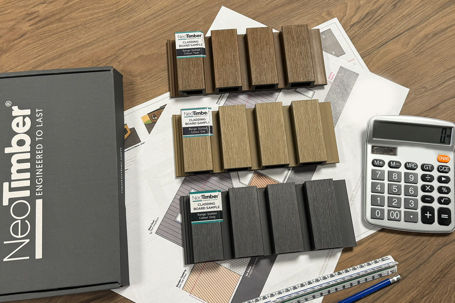
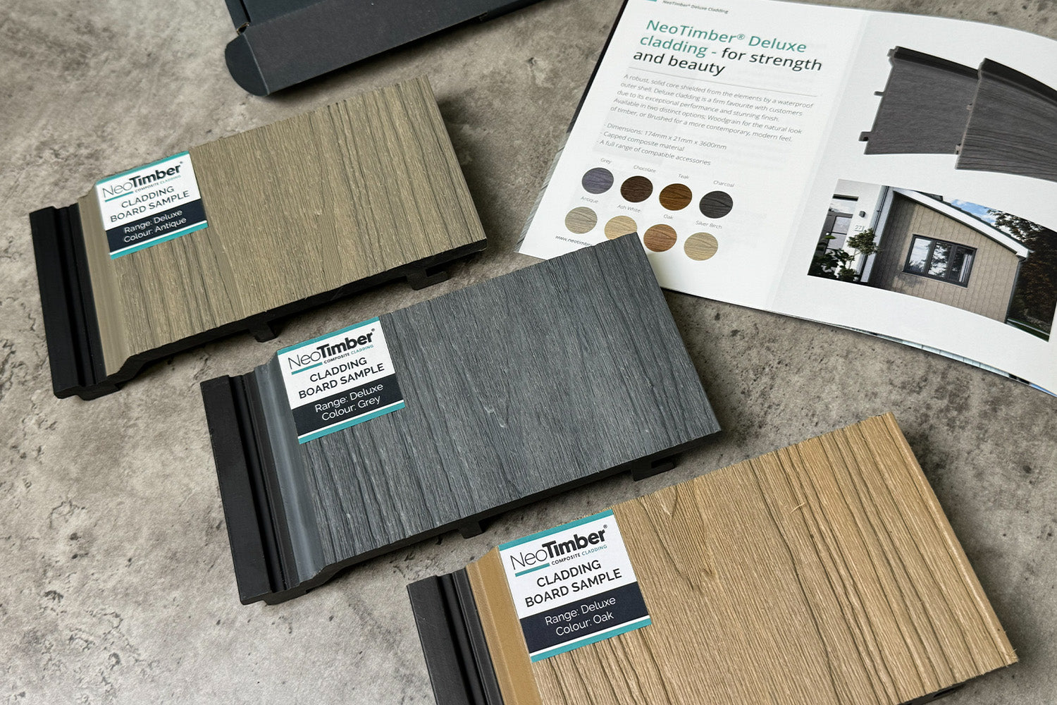
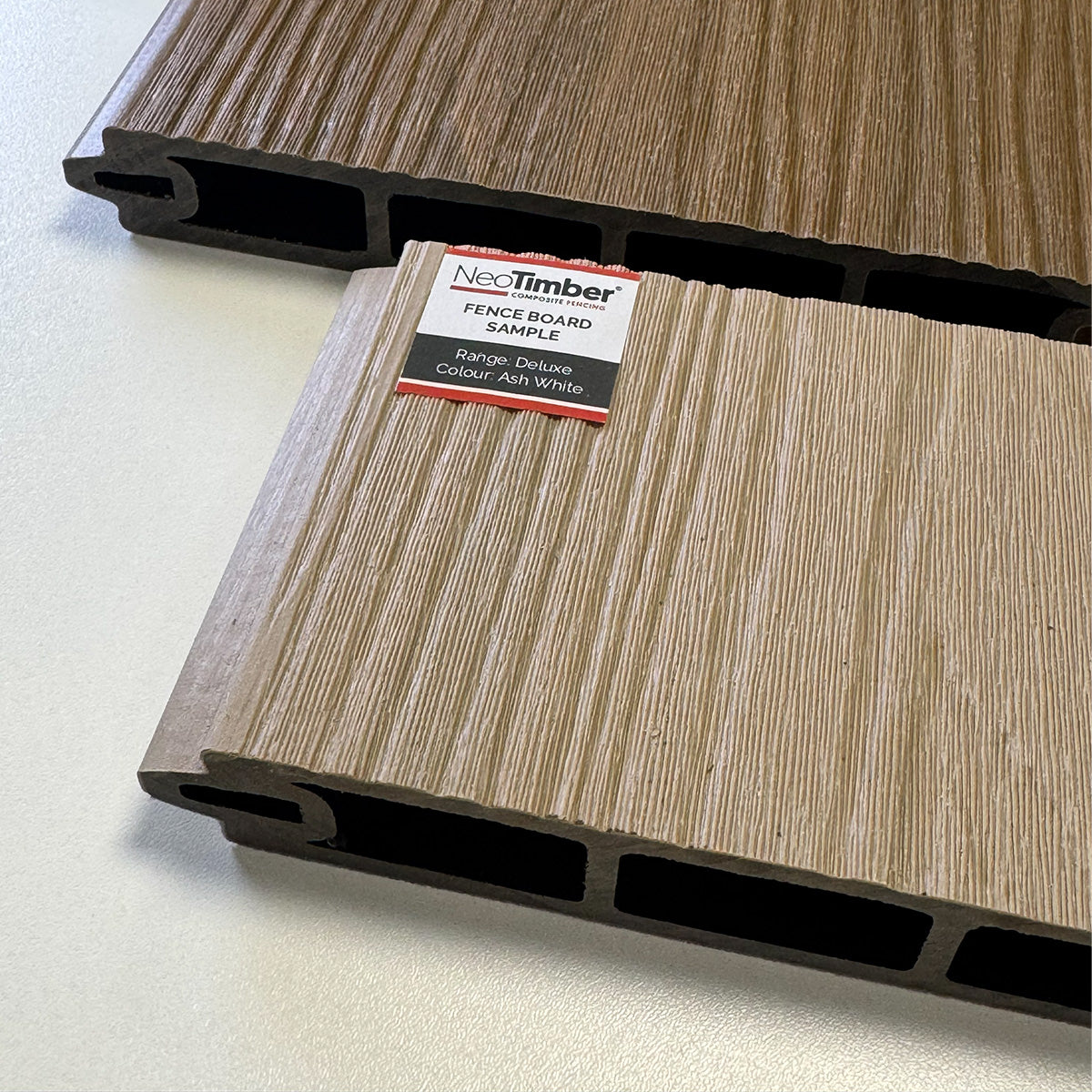
Sample pieces help with selection, but a larger repeated pattern will have a different visual scale. For a prominent feature, consider a small mock-up that includes the proposed gaps and background.
Ask about available samples through the sample service, explore our cladding resources or contact NeoTimber® for help comparing the options.
Composite Batten Cladding Colours FAQs
Which shade works best with dark window frames?
Charcoal can repeat the darker accent, while Oak or Teak can introduce warmth and contrast. Compare samples against the exact frame finish before choosing.
Is Charcoal the same as black?
Do not assume an exact match. Depth, undertone, texture and lighting can make two dark finishes look different, especially when installed directly beside each other.
Can I coordinate battens with my existing decking?
Yes, but aim for a considered pairing rather than assuming identical colour from a shared name. Compare the actual surfaces outdoors.
Will a light colour make a small feature look larger?
A lighter palette may feel less visually heavy, but proportions, gaps, background and surrounding materials also affect the impression. Test the arrangement in context.
Will capped composite keep exactly the same colour?
Fade resistance does not mean permanently unchanged appearance. Check the selected product’s expected weathering and follow its care guidance. Our outdoor batten care guide explains what to consider.
Can I use the same finish indoors?
Confirm that the selected system is suitable for the intended interior application. You can repeat a colour theme without assuming an exterior product is approved for every indoor setting.