


How to Pair Decking Shades for a Balanced Two-Colour Garden Design
Contrasting composite decking colours can give an outdoor space a defined border, a focal point or a clearer sense of separate areas. A lighter main surface with a dark frame creates a different effect from two warm browns, but both can look considered when the palette works with the home and garden.
Start with one principal colour and decide what the second shade should do. Is it framing the deck, highlighting a seating area or connecting the boards with the window frames? A clear purpose helps the contrast feel deliberate.
Explore NeoTimber’s decking guide for an overview, or browse the composite decking range as you compare possible combinations.

Can You Mix Composite Decking Colours?
Yes, where the selected products are compatible with the proposed installation. Colour is only one part of the specification: check board thickness, profile, fixing system, support and finished levels before combining products.
Do not assume two boards can be mixed simply because their colours look good together. Ask for advice if you are combining different ranges or adding a border to an existing deck.
Use our deck board guide alongside the composite decking colours guide to connect the visual choice with the product specification.
Four Contrasting Composite Decking Colour Pairings
| Pairing | Design direction | Idea to explore |
|---|---|---|
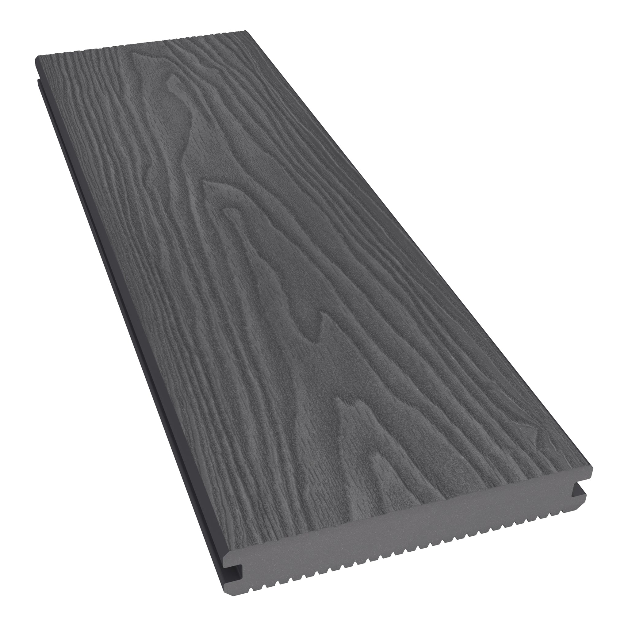
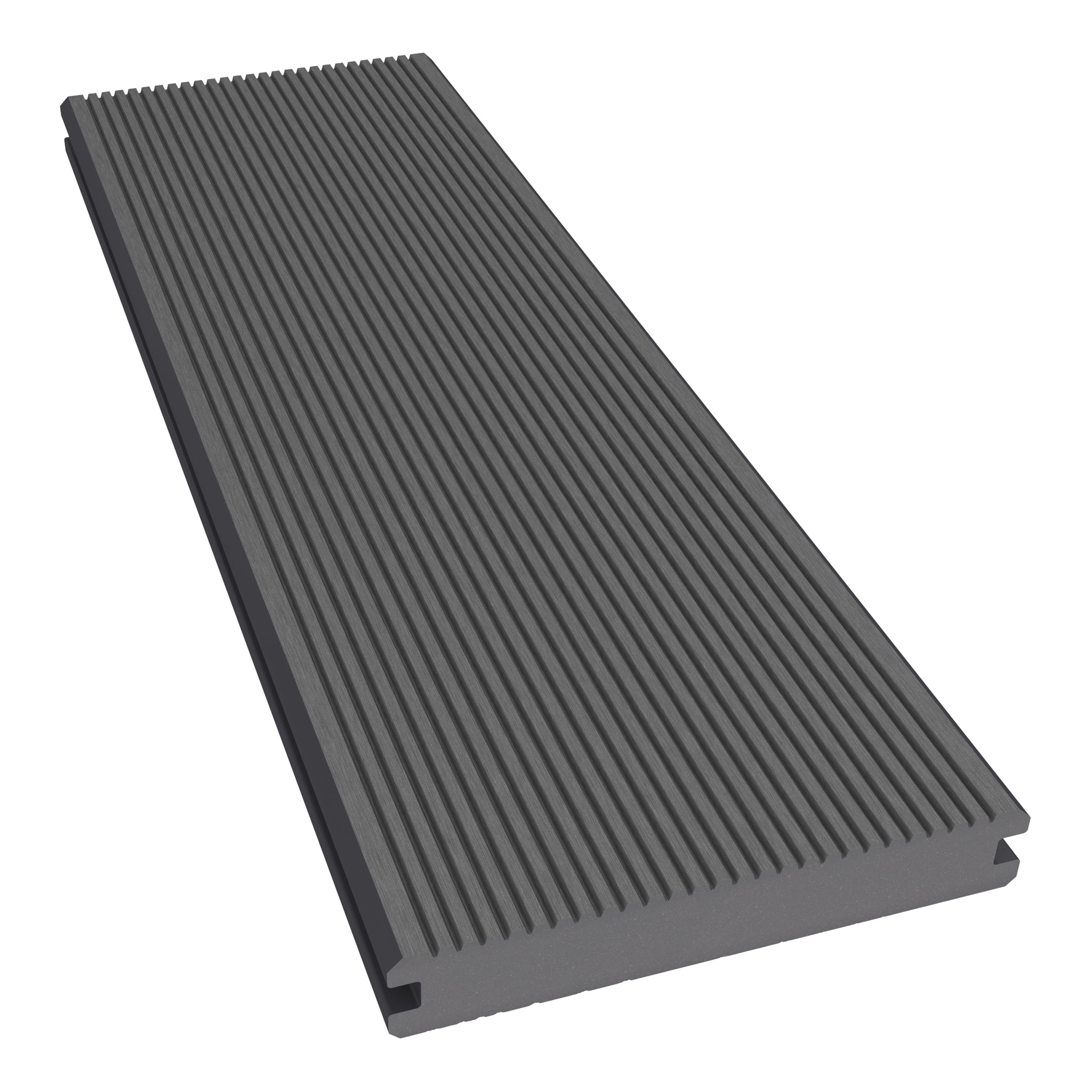
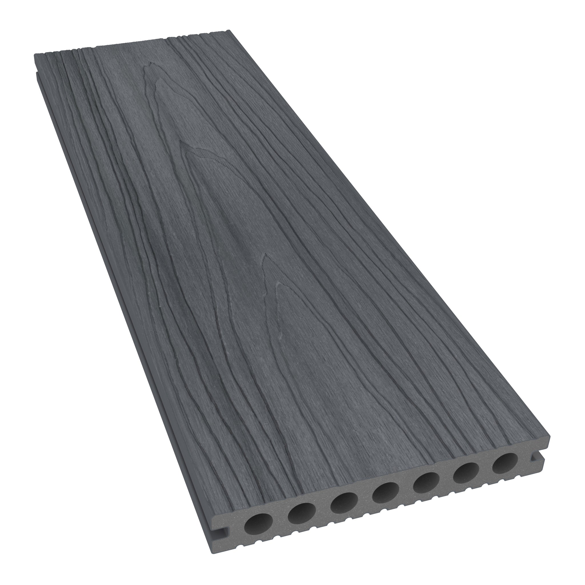
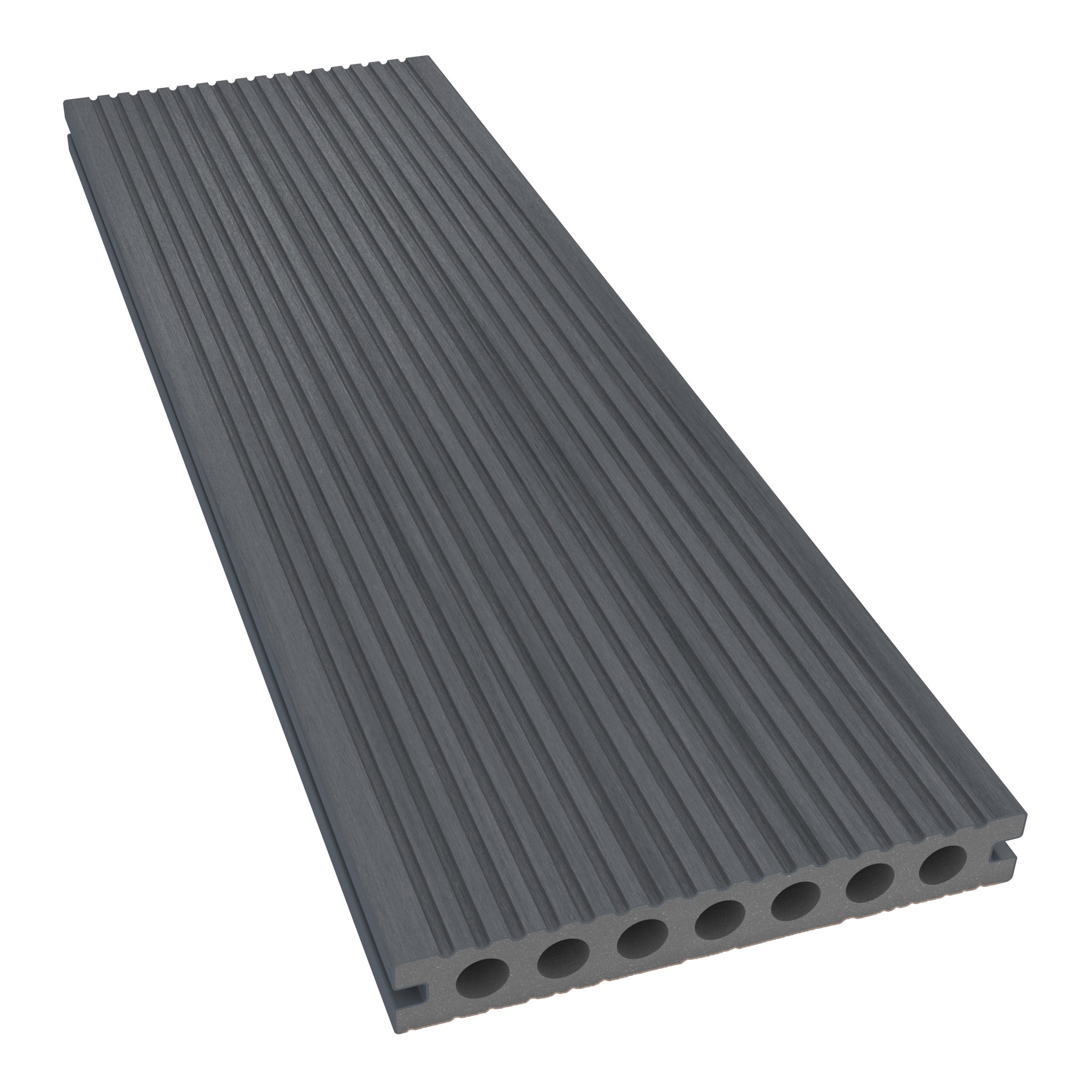
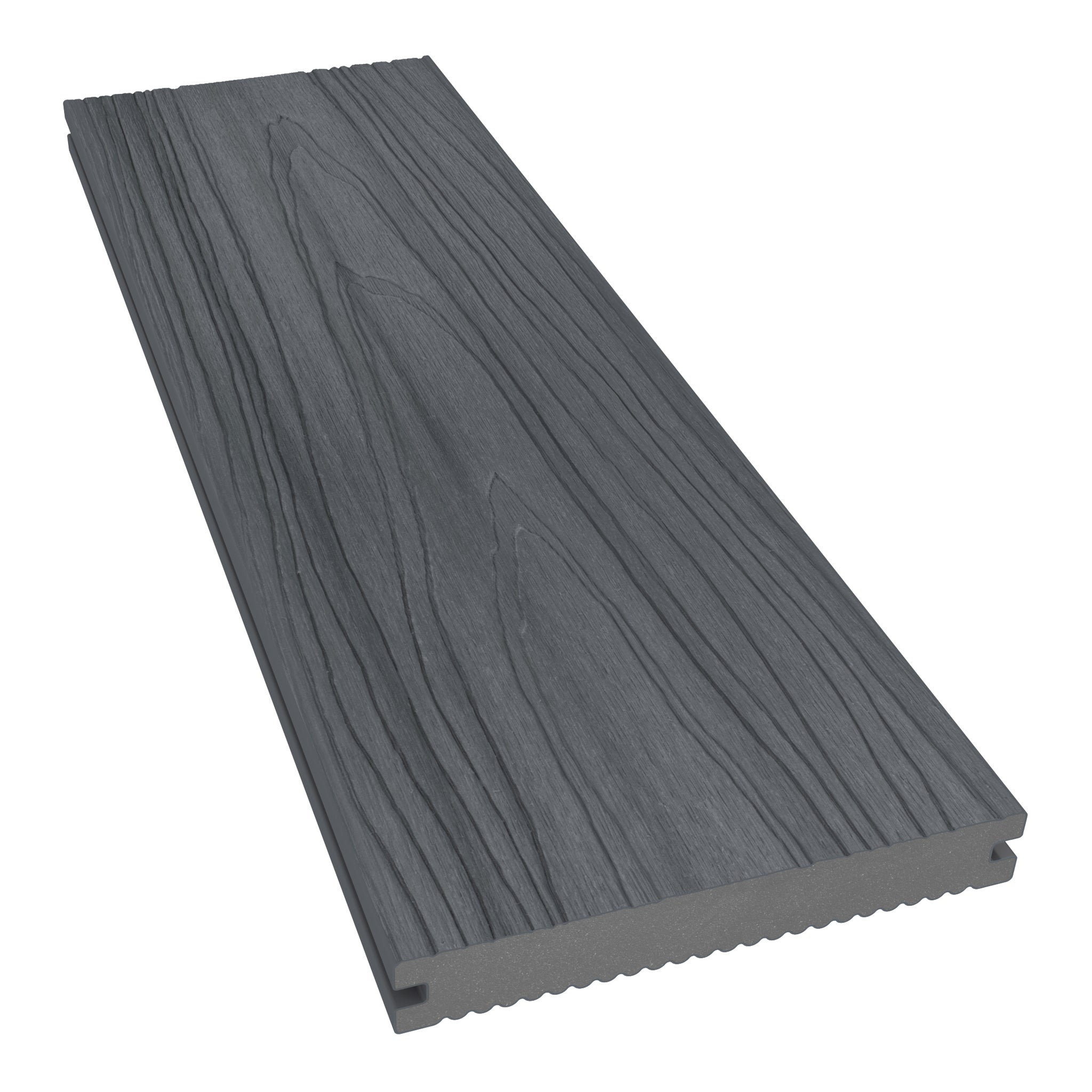
| Antique and Grey | A restrained neutral contrast | Antique main boards with a Grey border |
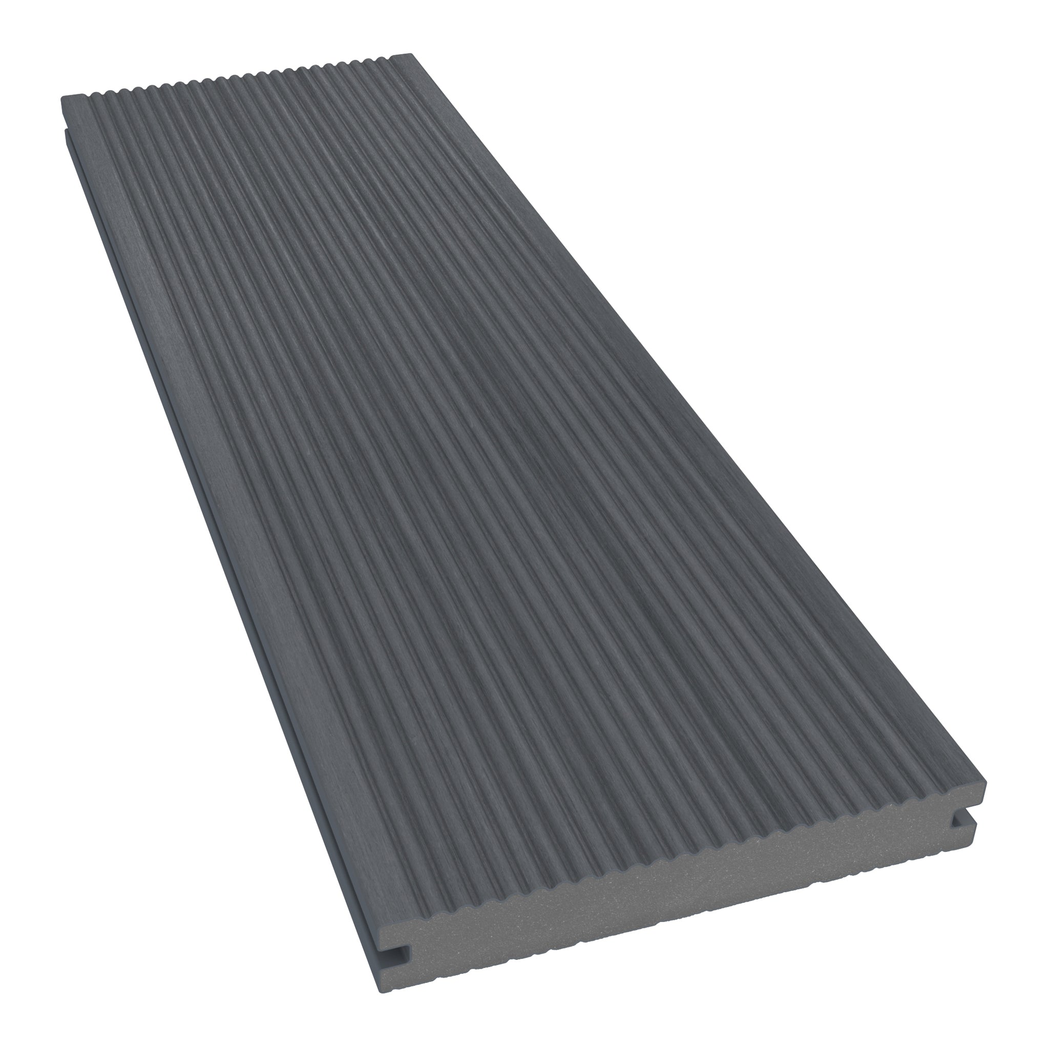
| Grey and Charcoal | A tonal, contemporary palette | A darker frame around a Grey surface |
| Antique and Charcoal | A more pronounced light-and-dark effect | Charcoal edging that echoes dark window frames |
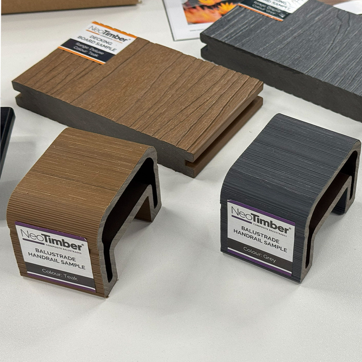
| Teak and Chocolate | A warm, timber-inspired combination | Chocolate accents around a Teak seating area |
Antique and Grey: A Subtle Neutral Combination
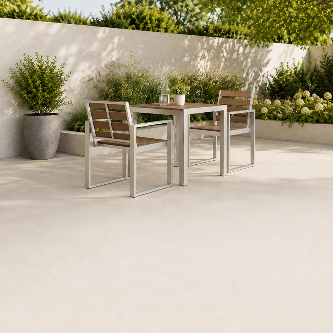
Antique and Grey are worth comparing if you want definition without a stark colour change. The pairing can suit a garden with pale paving, textured planting and neutral furniture.
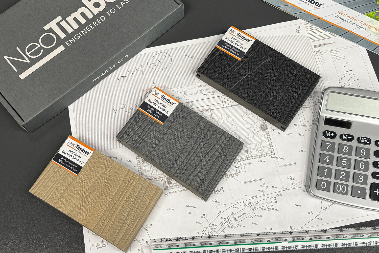
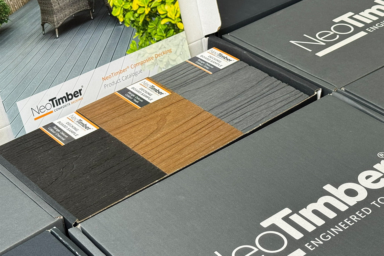
Lay samples together to see how their undertones relate. A colour that appears cool in one photograph can look warmer beside brickwork or in direct sunlight.

Grey and Charcoal: Tonal Contrast with a Defined Edge
Pairing Grey with Charcoal creates contrast within a related palette. Use the darker shade for a perimeter or a single feature line rather than adding several unrelated accents.
Repeat Charcoal in furniture frames or planters if you want the border to feel connected to the wider scheme. Lighter cushions and greenery can soften the overall appearance.

Antique and Charcoal: A Stronger Light-and-Dark Pairing
Antique and Charcoal offer a more distinct contrast. This can work well where the house already combines pale walls with darker doors or window frames.
Keep the proportions in mind. A narrow dark border produces a different result from dividing the entire deck into equal areas. Sketch both versions before ordering.

Teak and Chocolate: Warmth with Added Depth
Teak and Chocolate provide a warmer alternative to a grey-based scheme. The lighter and darker browns can sit comfortably alongside brick, terracotta pots and leafy borders.
Try Teak across the main surface with Chocolate defining the edge. Cream textiles or muted green accessories can complement the palette without introducing another dominant colour.

Where to Use a Second Decking Colour
Picture-Frame Borders
A contrasting frame gives the surface a clear outline. Plan it before the subframe is built so the border and intersecting boards have the necessary support.
Explore our decking edging options and check how corners, joints and movement allowances will be handled.
Inlays and Separate Seating Areas
A single inlay can break up a large deck or distinguish dining from relaxed seating. Let the furniture layout inform the position rather than introducing lines that fall awkwardly beneath tables or across routes.
A colour change is a visual device, not a substitute for suitable lighting, guarding or properly designed steps where required.
Changes in Board Direction
You can combine a second colour with a change in laying direction, but keep the design readable. A restrained layout often gives the contrast more impact than several competing patterns.
Review the complete installation guidance before finalising unusual arrangements.
Coordinate Furniture and Accessories with the Main Board Colour
Plan furniture sizes and colours alongside the deck, rather than waiting until installation is complete. Samples, photographs and a simple layout sketch help you assess the whole scheme together.
Antique: Soft Neutrals and Muted Greens
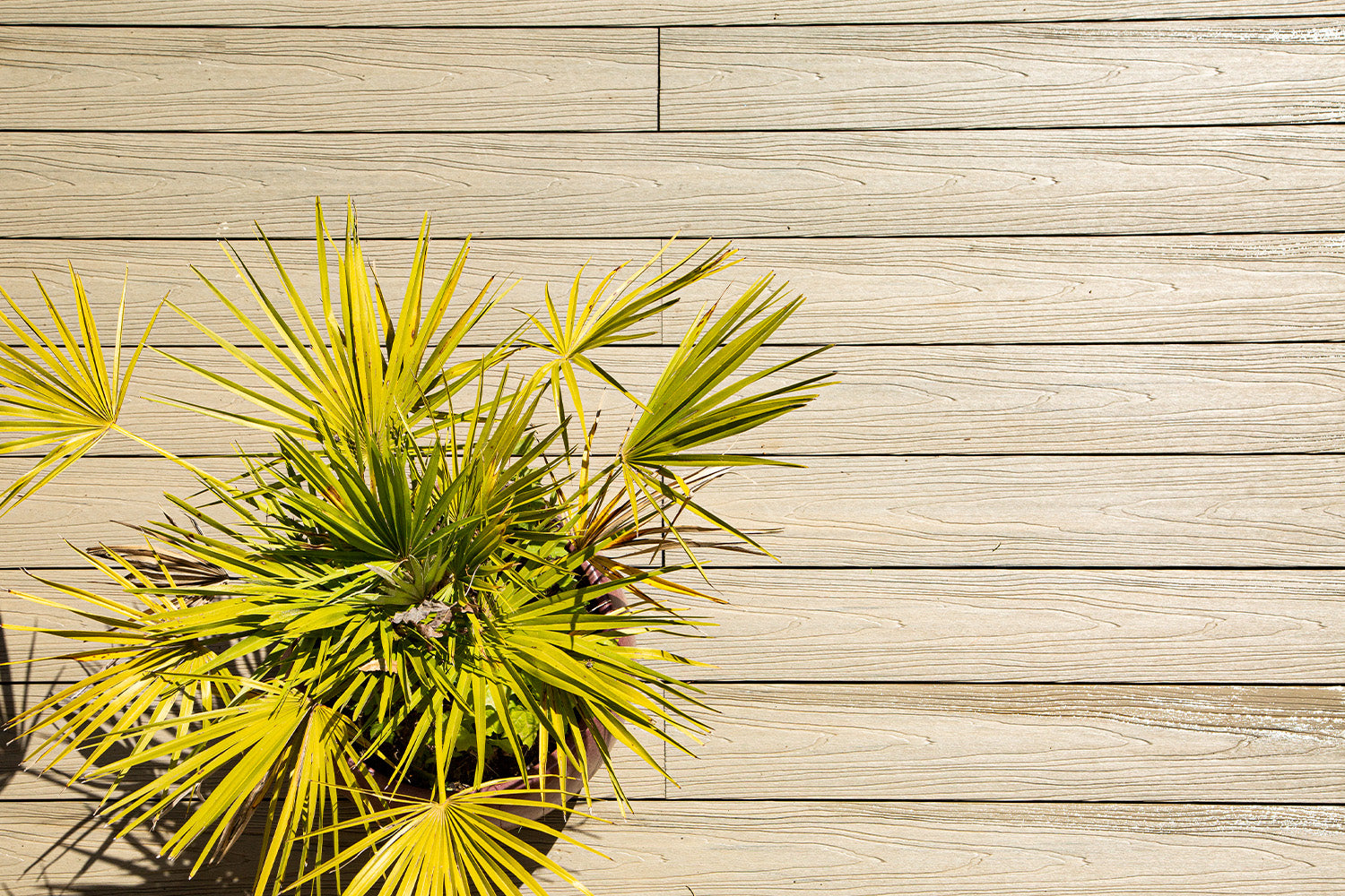
Consider cream, beige and pale grey textiles with Antique. Black furniture frames can repeat a darker border, while muted greens link the seating area with the planting.

Charcoal: Light Furniture or a Controlled Colour Accent
A Charcoal surface can provide a backdrop for pale cushions or one stronger accent, such as yellow or burgundy. Repeat the accent sparingly to avoid overwhelming the deck’s own colour contrast.

Teak: Cream, White and Natural Textures
Teak can work with cream fabrics, woven textures and simple pots. If Chocolate is the second board colour, echo that deeper brown in a small number of accessories.

Grey: A Flexible Base for Seasonal Styling
Grey offers room to experiment with textiles and containers. Choose accessories that relate to the border colour so seasonal changes do not make the permanent scheme feel disjointed.

Chocolate: Earthy Colours and Lighter Highlights
Chocolate can be paired with olive greens, muted orange or cream. Lighter furniture details help balance the visual weight of a rich brown surface.

Check Samples, Weathering and Practical Details
- Compare both colours together: view them beside brickwork, paving and doors.
- Check different light: assess the pair in sun and shade rather than relying on a screen.
- Confirm compatibility: board dimensions and fitting details must suit the same design.
- Understand weathering: capped and uncapped boards may develop differently over time.
- Budget for the full layout: borders and inlays can add cuts, support and installation work.
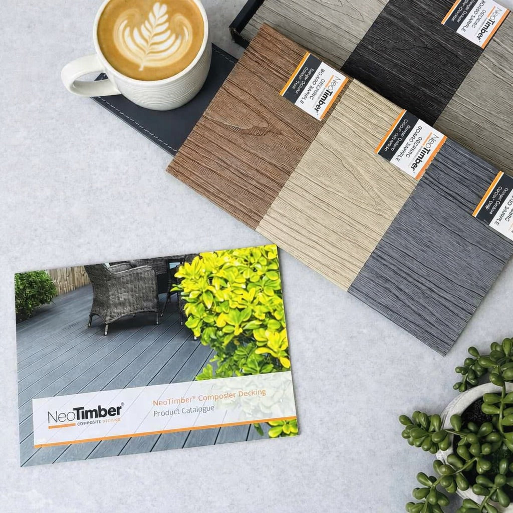
Photographs are useful inspiration, but camera settings, lighting and display screens affect the colours you see. Use the NeoTimber® composite decking gallery to explore layouts, then confirm your preferred shades with physical samples.
Contrasting Composite Decking Colours FAQs
Do I need an equal amount of both colours?
No. One main shade and a smaller contrasting detail can create a clearer result than an equal split. Choose the proportions around the garden’s size and layout.
Can I mix capped and uncapped boards?
Do not decide on colour alone. Confirm dimensions, support and fixing compatibility with the supplier, and consider differences in finish and weathering.
Will a contrasting border work on a small deck?
It can, provided the border remains proportionate and does not crowd the main area. Compare a simple outline with a single-colour layout before committing.
Create a Colour Combination That Fits Your Garden
Contrasting composite decking colours work best when they have a clear role. Choose a main surface, give the second shade a purpose and connect both with the home, planting and furniture.
Request free composite decking samples to compare your shortlist, browse our composite decking or contact NeoTimber® for help checking the product details.