

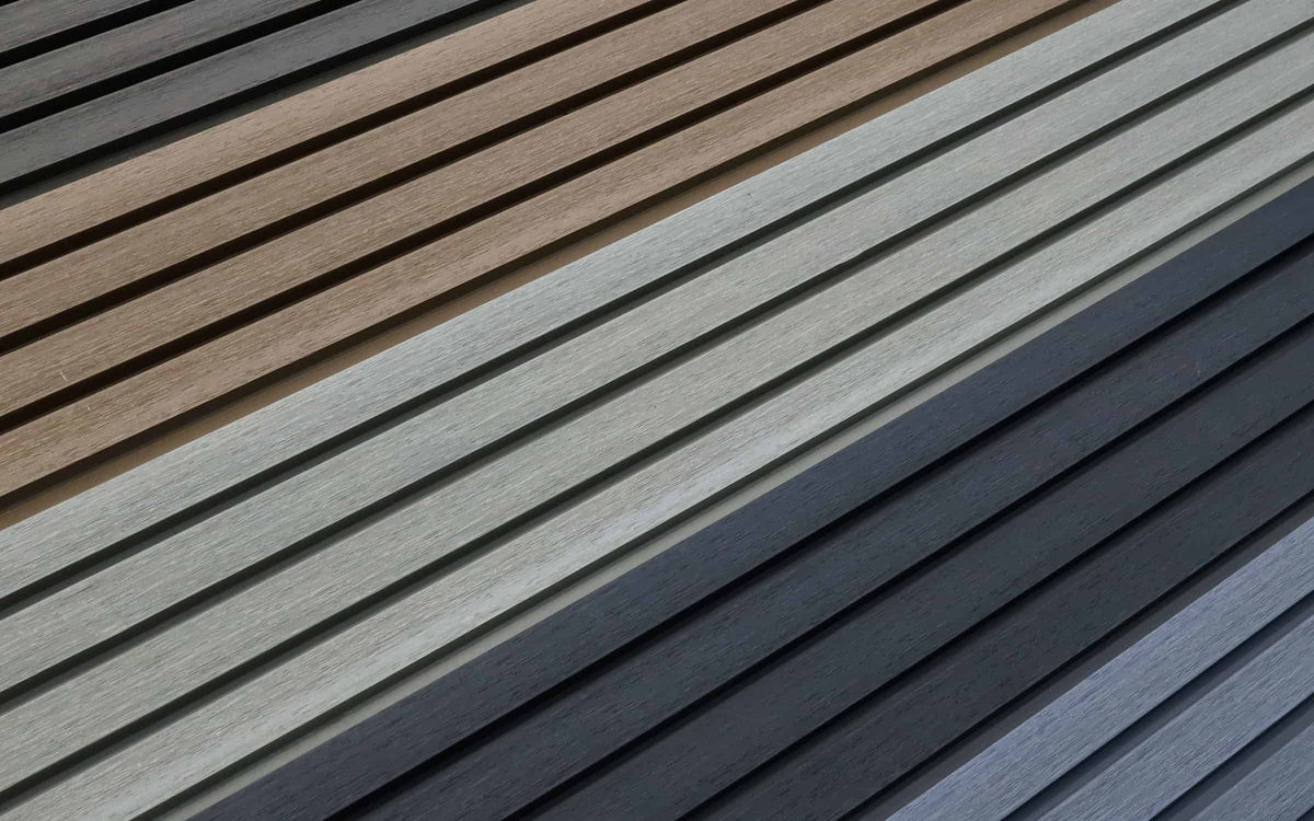
Discover the Right Cladding Shade for Your Home
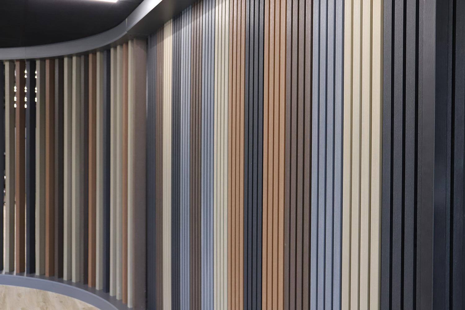
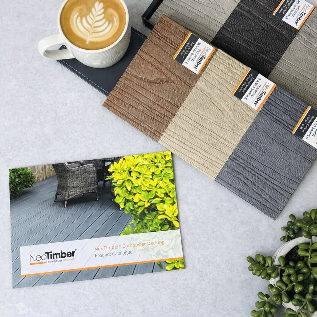
NeoTimber® composite cladding colours include Ash White, Antique, Charcoal, Chocolate, Grey, Oak, Silver Birch and Teak. From pale neutrals to deeper wood-inspired shades, the palette gives you different ways to coordinate an exterior with brickwork, render, windows and landscaping.
The best choice starts with your property. A colour that looks striking on a garden room may create a different effect across a large house elevation. Light, board texture and neighbouring materials all influence how the finished wall appears.
This guide compares the eight shades, suggests combinations to explore and explains how to narrow down your shortlist. Browse the NeoTimber® composite cladding collection alongside the guide to check the options for your preferred board.
Which Composite Cladding Colours Are Available?
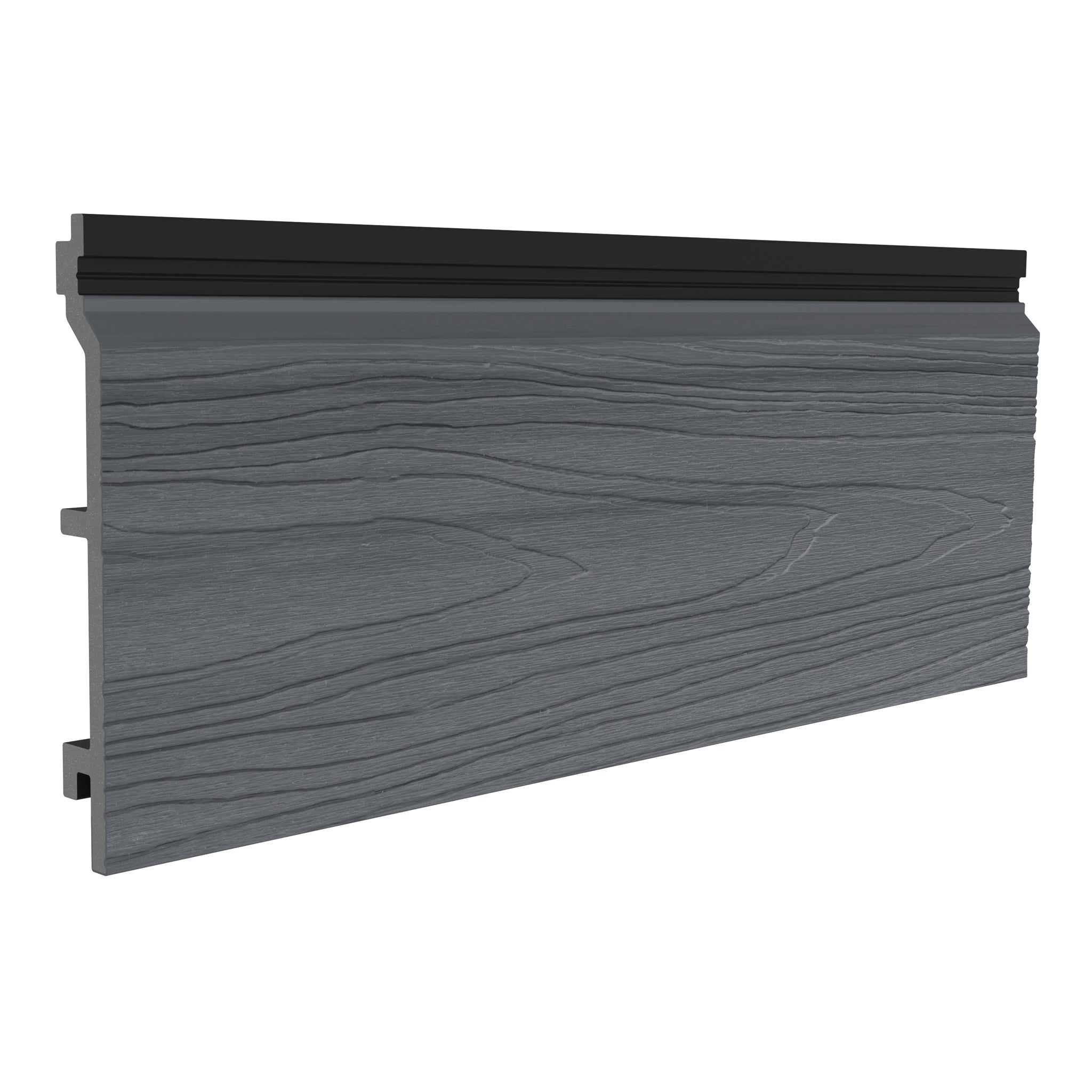
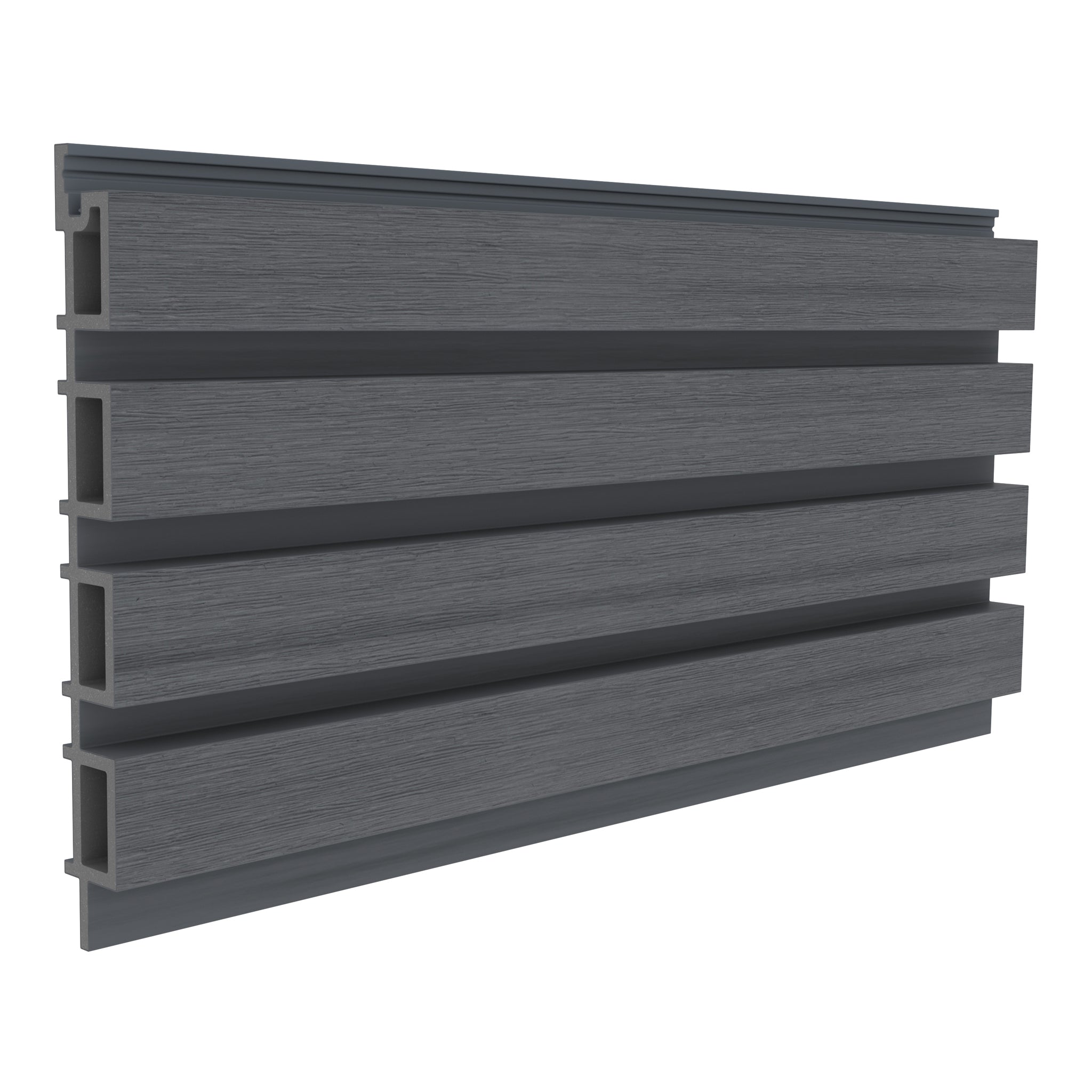
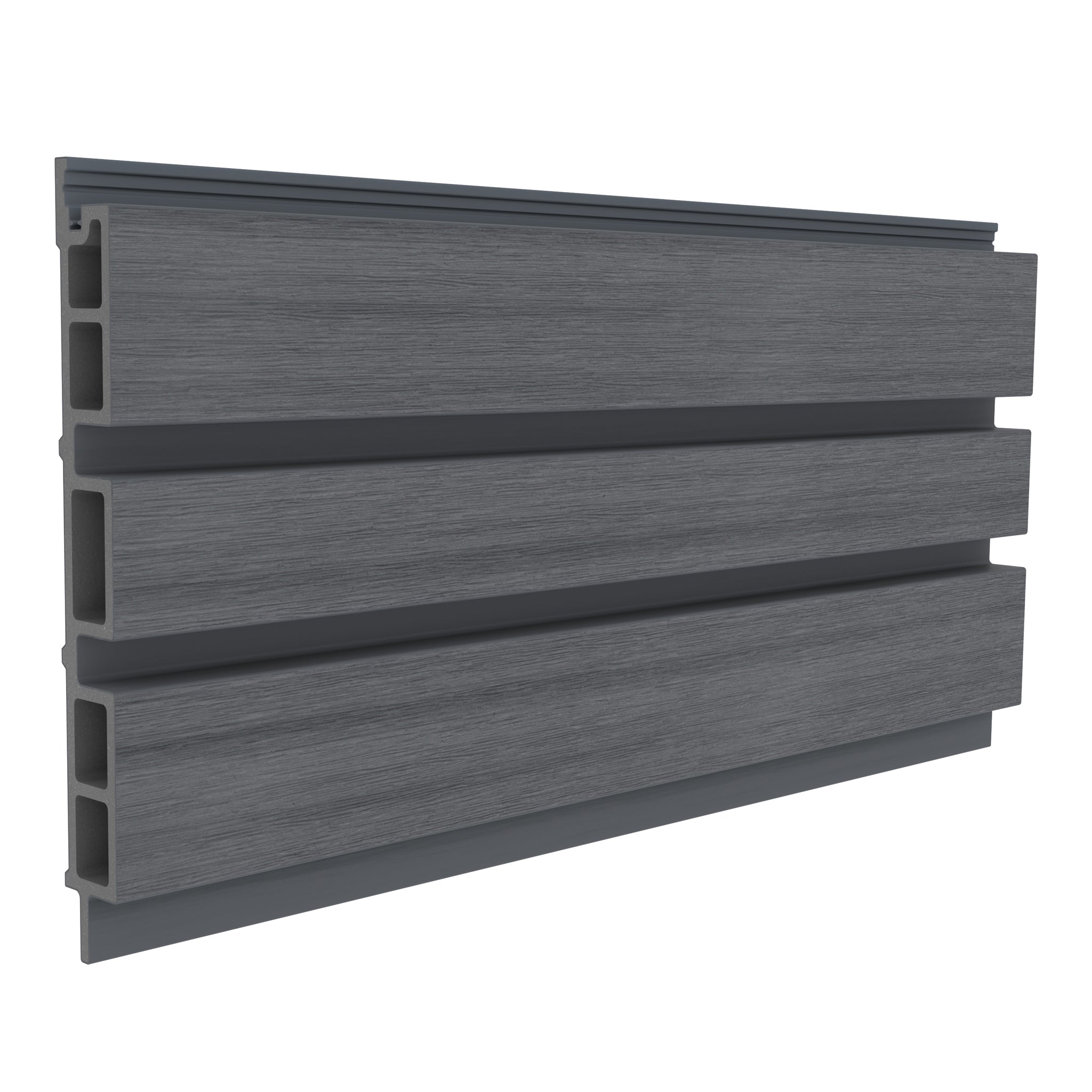
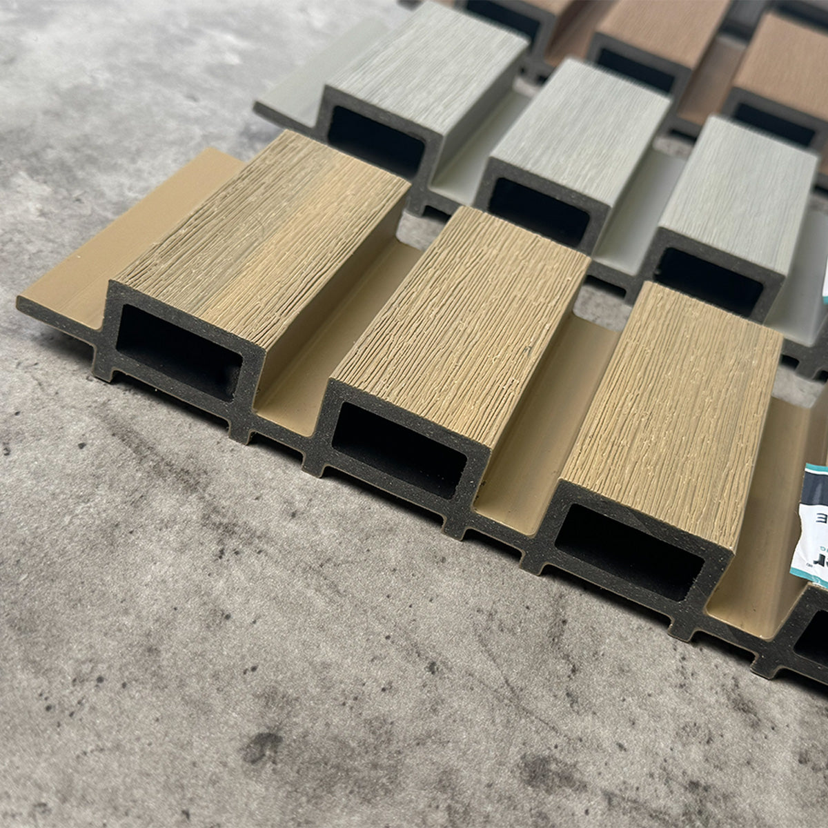
Colour availability varies by range. Classic boards are listed in Grey, Teak, Chocolate and Charcoal. Deluxe and Slatted options offer a wider eight-colour palette. Check the specific board profile, finish and length before ordering, together with the compatible trims.
| Colour | Overall impression | Pairings to explore |
|---|---|---|
| Ash White | Pale, soft neutral | Light paving, natural textures and dark window frames |
| Antique | Muted, weathered wood effect | Natural stone, grey accents and restrained planting |
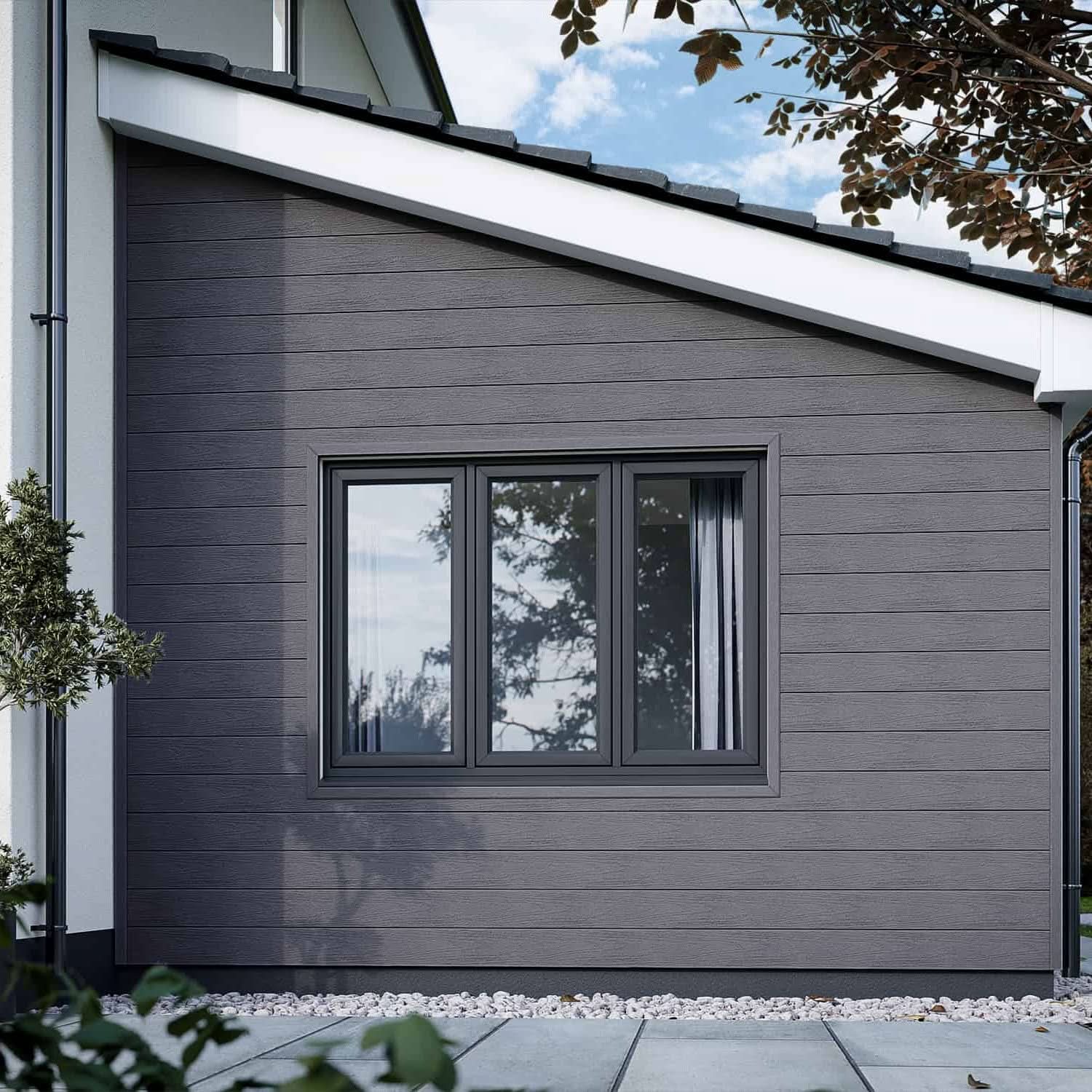
| Charcoal | Deep, dramatic tone | White render, pale paving and green foliage |
| Chocolate | Rich, dark brown | Cream render, warm brick and earthy landscaping |
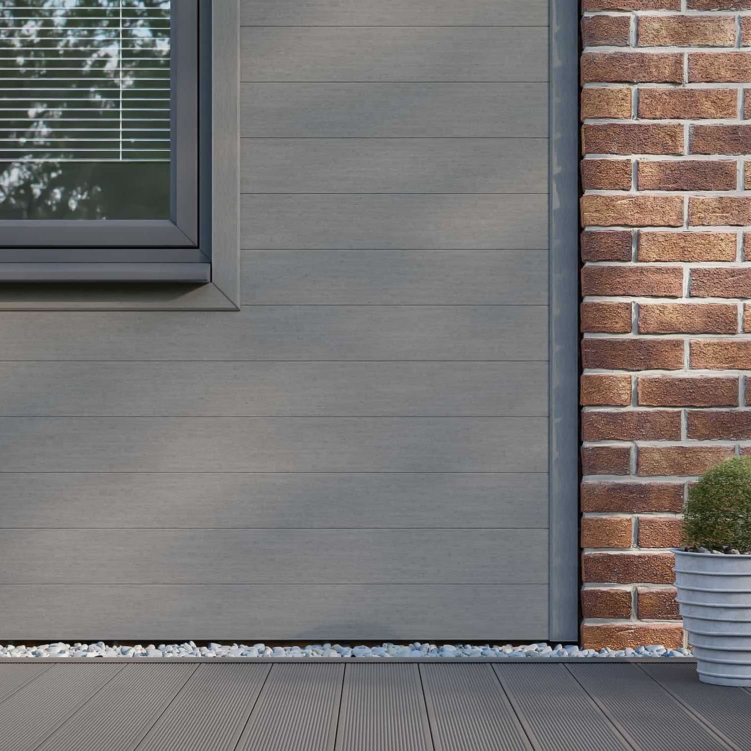
| Grey | Contemporary neutral | Anthracite frames, white walls and cool-toned paving |
| Oak | Warm, light brown | Black-framed glazing, pale stone and garden greenery |
| Silver Birch | Soft, cool beige | Light render, grey frames and neutral outdoor furniture |
| Teak | Warm, honey-inspired tone | Dark metalwork, cream finishes and leafy planting |
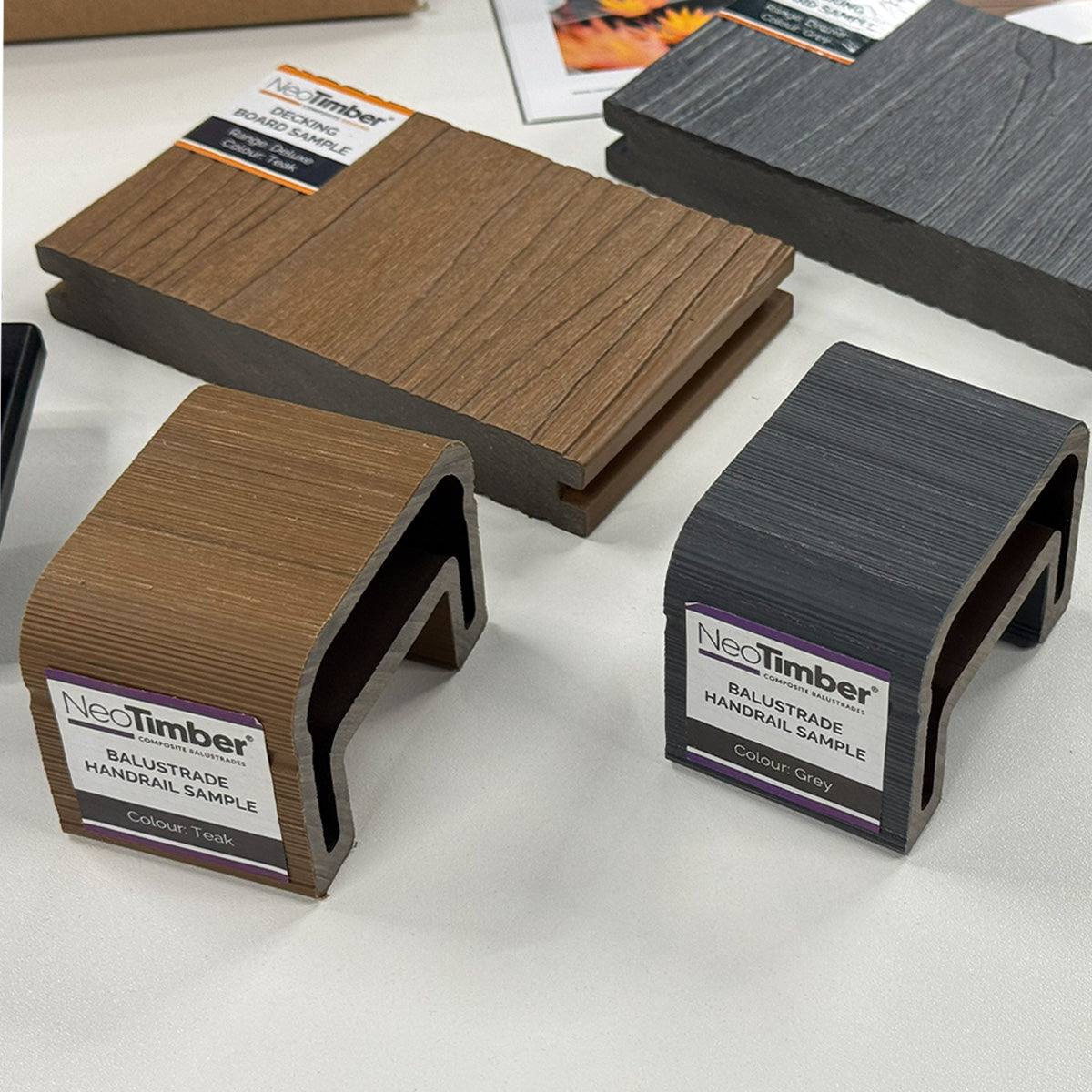
Use these combinations as design starting points. Photographs and screen settings affect colour appearance, so compare physical samples at your property before making the final choice.
Ash White Composite Cladding
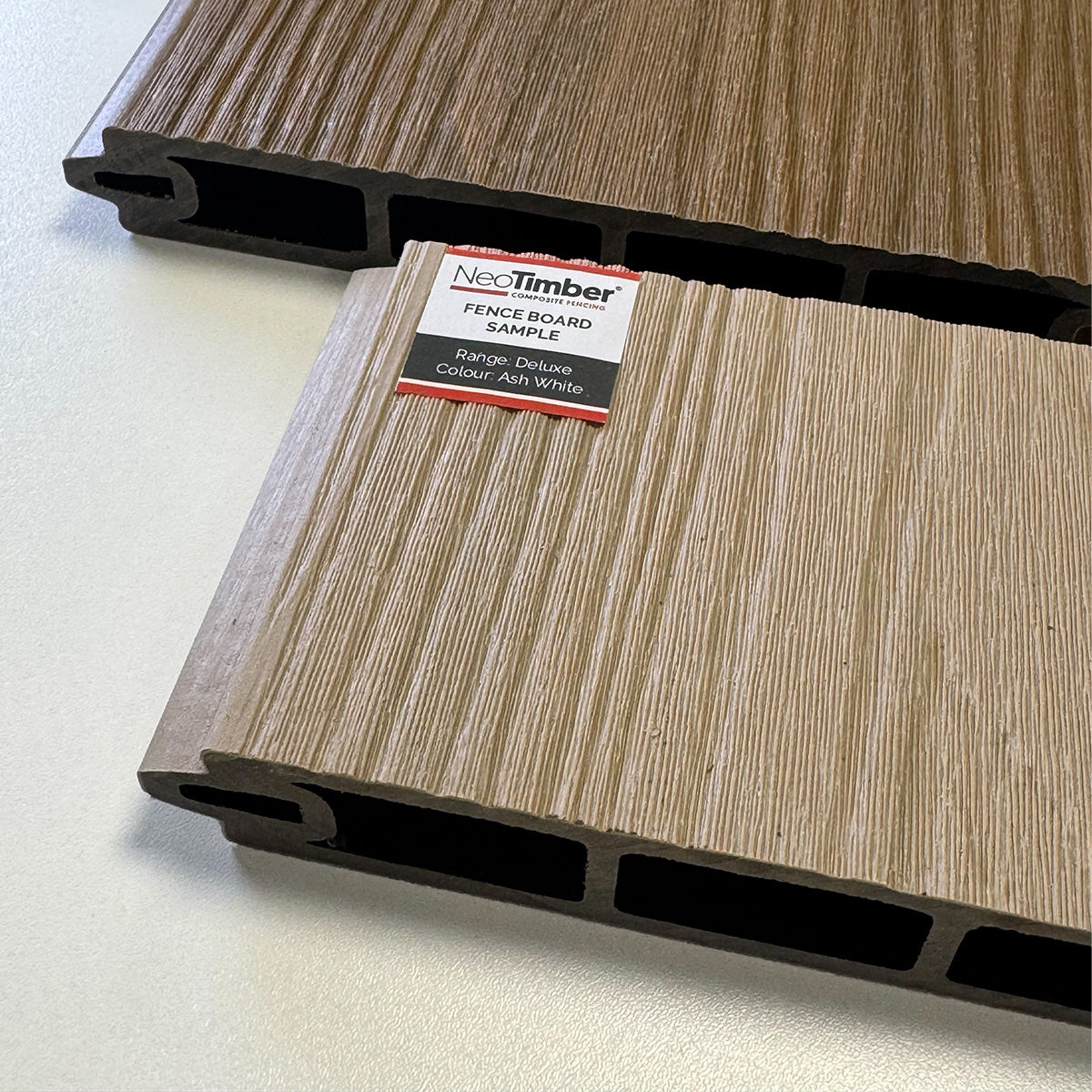
Ash White is a pale option for a light, understated exterior. Consider it for a garden room, a sheltered seating backdrop or an extension where you want the wall finish to feel quiet and neutral.
Pair it with natural textures for a softer scheme, or introduce dark doors and window frames for definition. Check the sample beside any existing white render: two pale finishes can have noticeably different undertones, even when they look similar online.

Antique Composite Cladding
Antique offers a muted wood-inspired appearance that suits a restrained, weathered-look palette. It is a useful shade to compare when you want texture without the stronger warmth of a honey-toned finish.
Try it beside natural stone, neutral paving or charcoal details. On a traditional property, a small feature section can introduce a contemporary material while keeping the wider colour scheme calm. Explore more ideas in our Antique composite cladding guide.

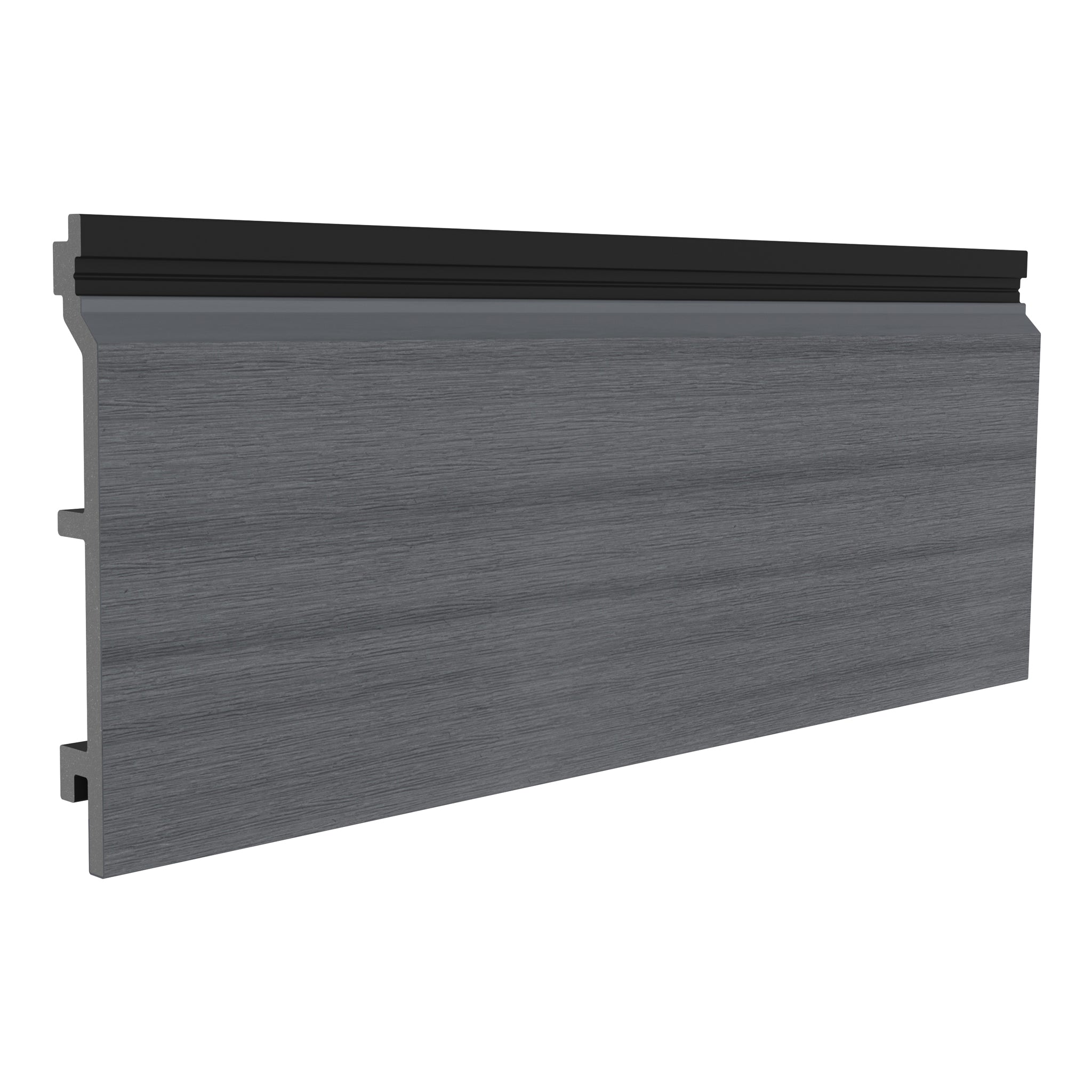
Charcoal Composite Cladding
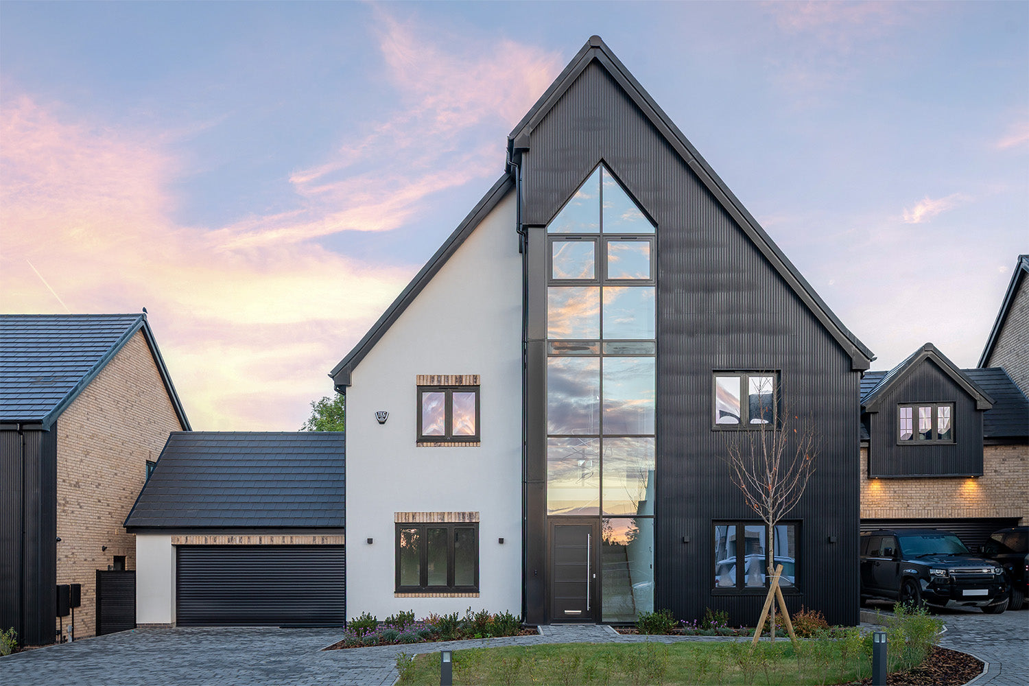
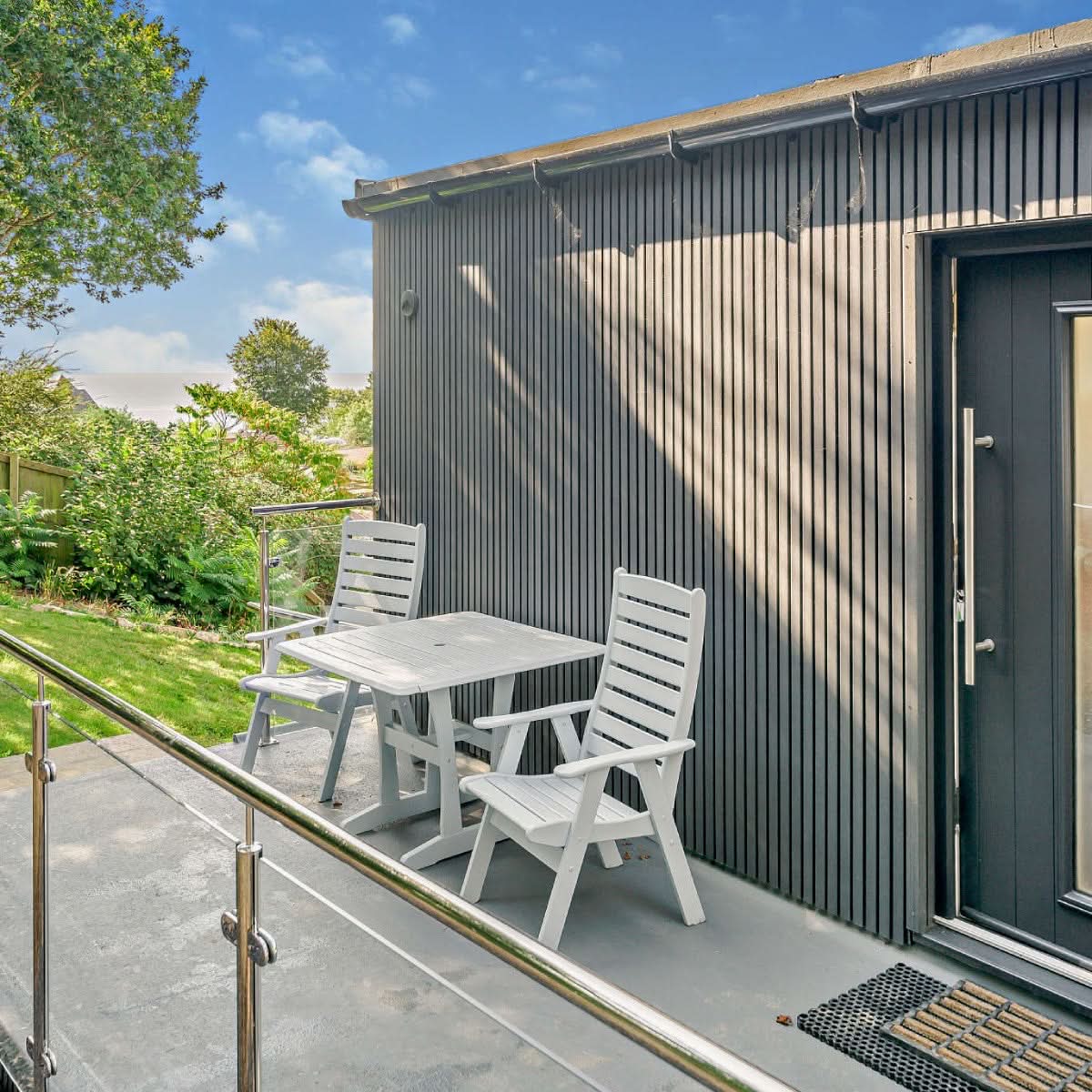
Charcoal creates a strong contrast against pale walls and highlights the shape of surrounding greenery. It can define an entrance, frame a glazed garden room or give a selected elevation a more pronounced outline.
Consider how much of the building you want the darker colour to cover. A feature wall and a full elevation will make different visual statements. Compare Charcoal with your window frames in daylight rather than assuming it will be an exact black or anthracite match. See our dark composite cladding inspiration for further ideas.

Chocolate Composite Cladding
Chocolate brings a deeper brown tone to an exterior, making it an option for those drawn to the appearance of dark timber. It can provide a rich backdrop to cream render, pale gravel and planted borders.
When combining it with red or brown brickwork, compare the undertones carefully. A deliberate contrast can look more considered than an almost-match. Our brown composite cladding guide explores this warmer part of the palette.

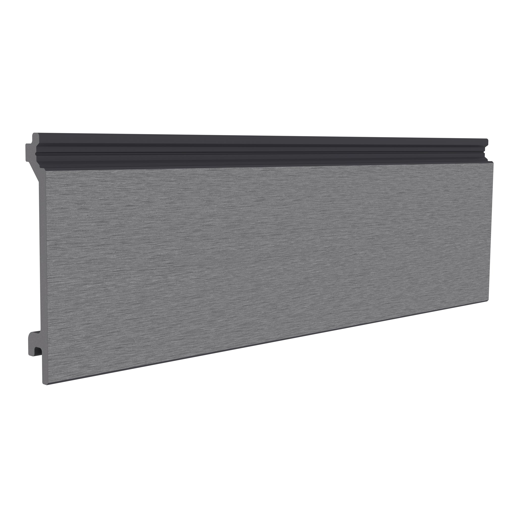
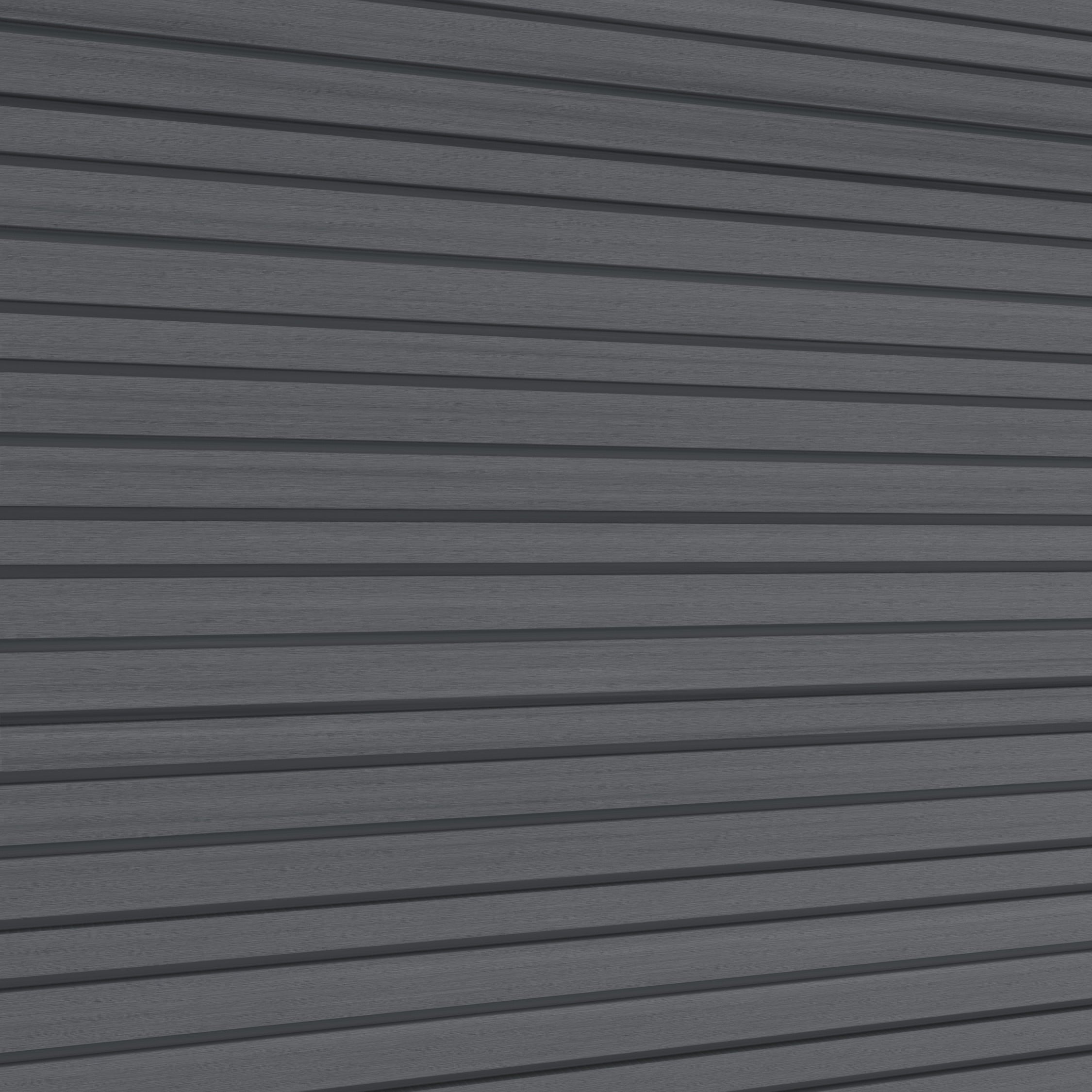
Grey Composite Cladding
Grey is a versatile starting point for a contemporary exterior. It can connect different elements of a renovation, particularly where grey paving, dark glazing frames or white render already feature.
Grey cladding does not need to match every grey surface around it. A lighter wall against darker frames can help windows and doors remain distinct. Compare samples in shade as well as sunshine, then explore our grey composite cladding ideas.

Oak Composite Cladding
Oak introduces a warm, light-brown finish that works well as a starting point for a timber-inspired garden design. It can soften the appearance of dark-framed glazing and add warmth beside pale paving.
For a garden room, compare Oak with the decking, fencing and furniture you intend to keep. You can choose complementary shades rather than matching every wood-effect surface. Repeating one warm tone elsewhere in the garden helps connect the scheme.

Silver Birch Composite Cladding
Silver Birch offers a soft, cool-beige option for a lighter exterior with a wood-inspired appearance. Consider it alongside light render, neutral stone and grey window frames when you want the texture to contribute as much as the colour.
Compare Silver Birch directly with Antique and Ash White if your shortlist centres on pale neutrals. Seeing the samples together makes their differences easier to judge than looking at separate photographs.

Teak Composite Cladding
Teak brings a warmer, honey-inspired tone to the palette. It can add a welcoming feel to a garden-room entrance or introduce warmth beside charcoal doors, black metalwork and green planting.
If you are choosing between Teak and Oak, view both samples against the same background at the same time. Focus on which works best with the fixed elements of your property. Find more combinations in our Teak composite cladding guide.

How to Choose Composite Cladding Colours
Start with the materials that will stay
Roof tiles, brickwork, windows and paving create the setting for your cladding. Build your shortlist around these fixed elements before considering furniture or accessories that are easier to change. A sample held against the actual wall is more useful than a colour viewed in isolation.
Review the colour throughout the day
Place samples near the intended installation and look at them in morning light, afternoon sun and shade. A sheltered side return can make a finish look different from the same board on a bright, open elevation. Look from inside the house too if the wall will form part of your everyday view.
Choose the profile and colour together
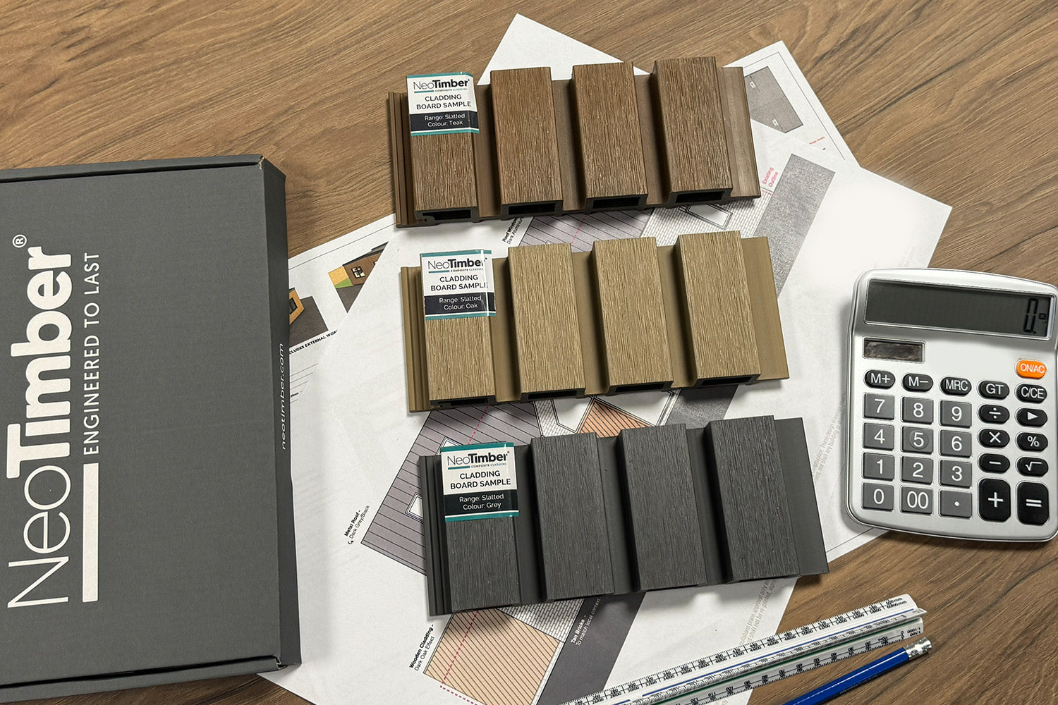
Woodgrain, brushed and slatted surfaces interact with light differently. The shadows in a slatted profile can change your impression of a shade, so assess the colour in the board style you intend to buy. Do not rely solely on a sample from a different range.
Plan trims and adjoining finishes
Include corner profiles, end trims and visible fixings in the colour decision. Check compatibility with the selected board range as well as the finish. Where cladding meets a window or another wall material, decide whether you want a coordinated edge or an intentional contrast.
Do Composite Cladding Colours Fade?
Colour behaviour depends on the product construction and its exposure. Avoid treating a colour name or a photograph as a promise that the appearance will remain completely unchanged. Ask for the weathering guidance for your selected range and consider the expected finish over time as well as its initial appearance.
Choose on the basis of the product information, a physical sample and realistic maintenance expectations. A structural warranty should not be read as a guarantee of unchanged colour; consult the NeoTimber® cladding warranty terms for the actual scope of cover.
Composite Cladding Colours: Frequently Asked Questions
Which colour works best with anthracite windows?
Grey can create a coordinated scheme, while Ash White or Silver Birch can introduce a lighter contrast. Oak and Teak offer a warmer alternative. Compare samples against your actual frames because anthracite finishes and cladding colours are not necessarily exact matches.
Can I combine two cladding colours?
A two-colour design can highlight an entrance or distinguish an extension from the original house. Give each colour a clear role and plan where they meet. Confirm that the board profiles and junction details are compatible before ordering.
Are all eight colours available in every range?
No. Classic has a four-colour selection, while Deluxe and Slatted options offer the broader palette. Check the individual product listing for the colour, finish and length combination you need.
Should I choose cladding from photographs alone?
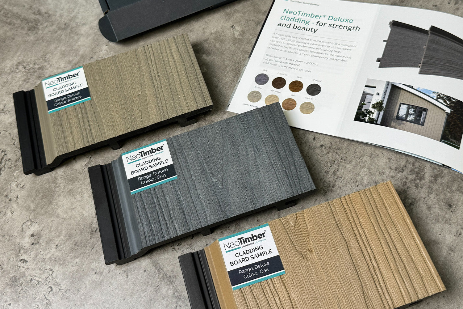
Photographs are useful for inspiration, but they cannot reproduce the exact appearance in your lighting. Order samples of your shortlisted colours and compare them outdoors beside the materials they will meet.
Find Your Favourite NeoTimber® Cladding Colour
Choose two or three shades that work with your property, then compare them in the intended setting. Considering the colour, texture and edge details together will help you create an exterior that feels consistent from the largest wall to the smallest junction.
Explore the NeoTimber® cladding collection, order composite cladding samples, or contact the NeoTimber® team for help checking your chosen range and accessories.